
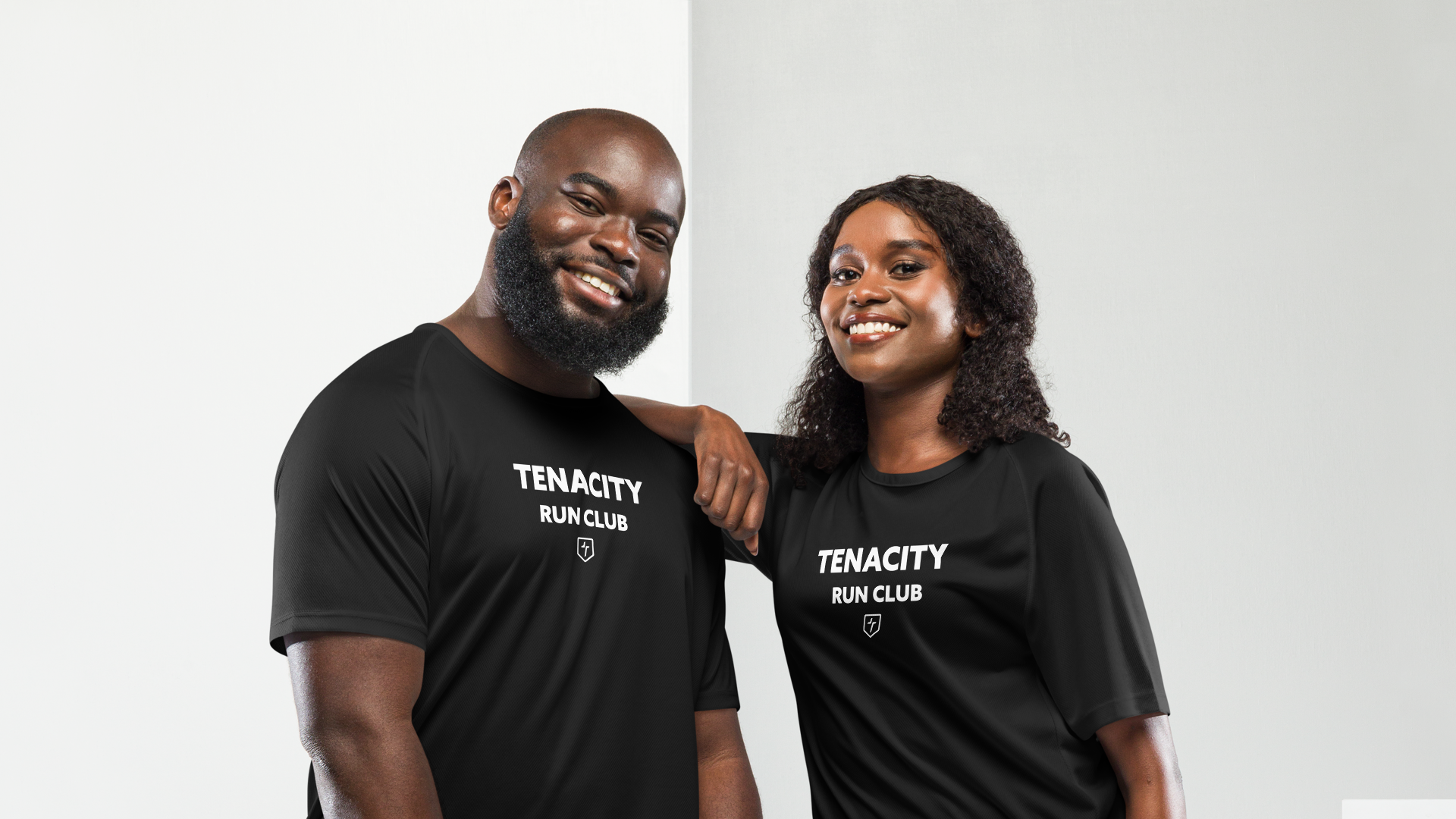
TENACITY SPORTSWEAR
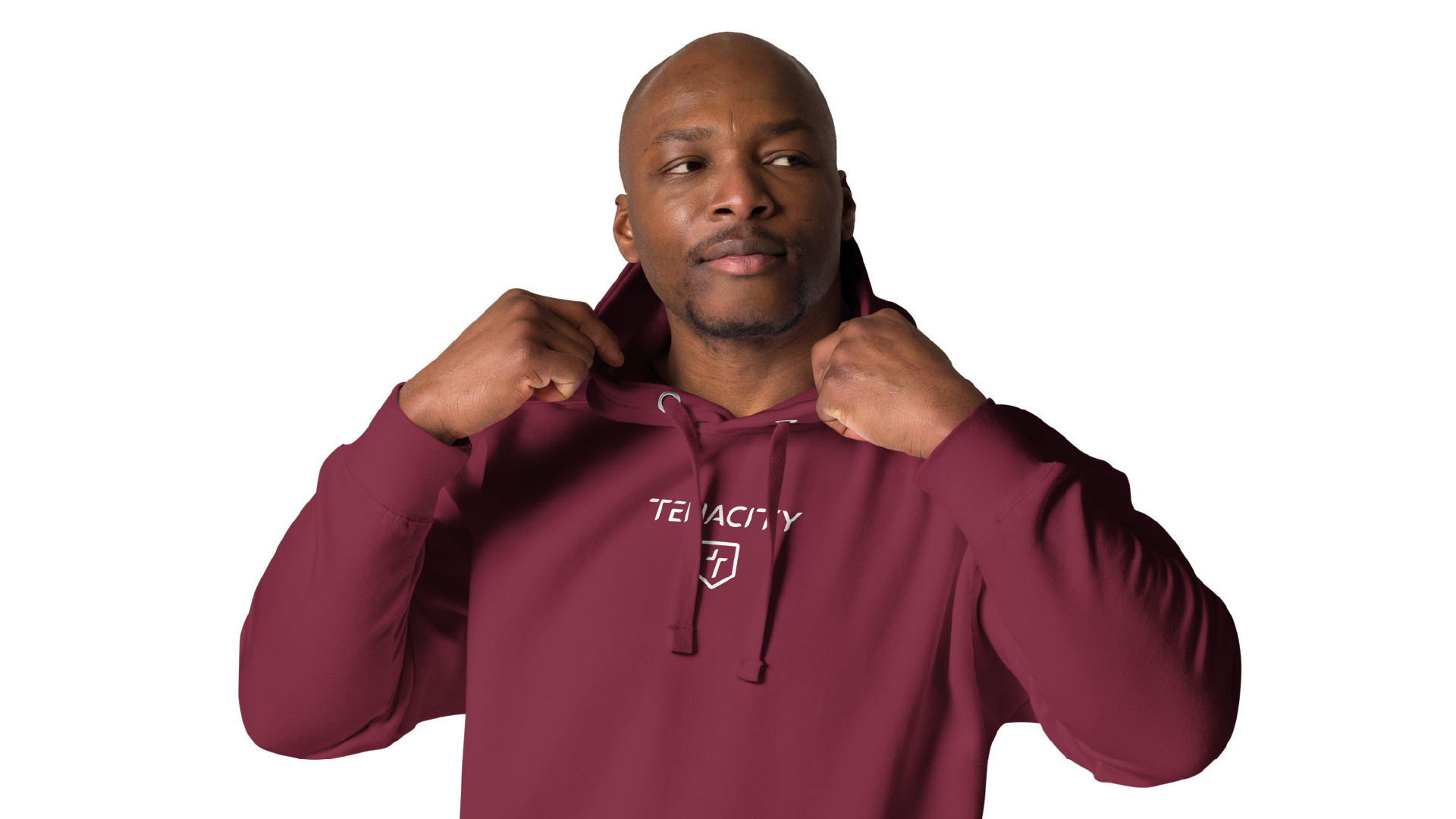
Tenacity Sportswear isn't just about sportswear, it's about building and support your inner strength. Founded by Ben Knight, whose life was profoundly impacted by a kidney disease diagnosis in 2024. Facing his diagnosis, Ben embarked on a journey to train for the 2025 London Marathon.
Running provided the space to clear his mind, manage stress, and cultivate an unwavering mindset. This transformative experience ignited the vision for Tenacity – a brand that recognises and champions the vital link between physical and mental health.
Client
Tenacity Sportswear
Year
2026
Logo Design
Brand Indentity
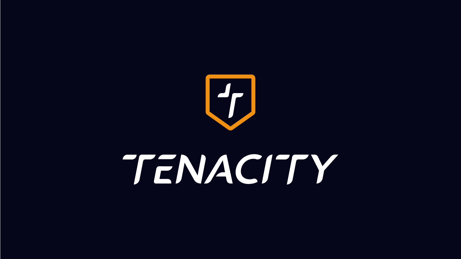
This was a really inspiring project! I had the pleasure of working with Ben to create the brand for Tenacity Sportswear, a company with a powerful focus on both athletic performance and mental well-being. Ben wanted a brand that truly represented resilience and support, while also showcasing that incredible drive we all have to push ourselves and become a better version of ourselves.
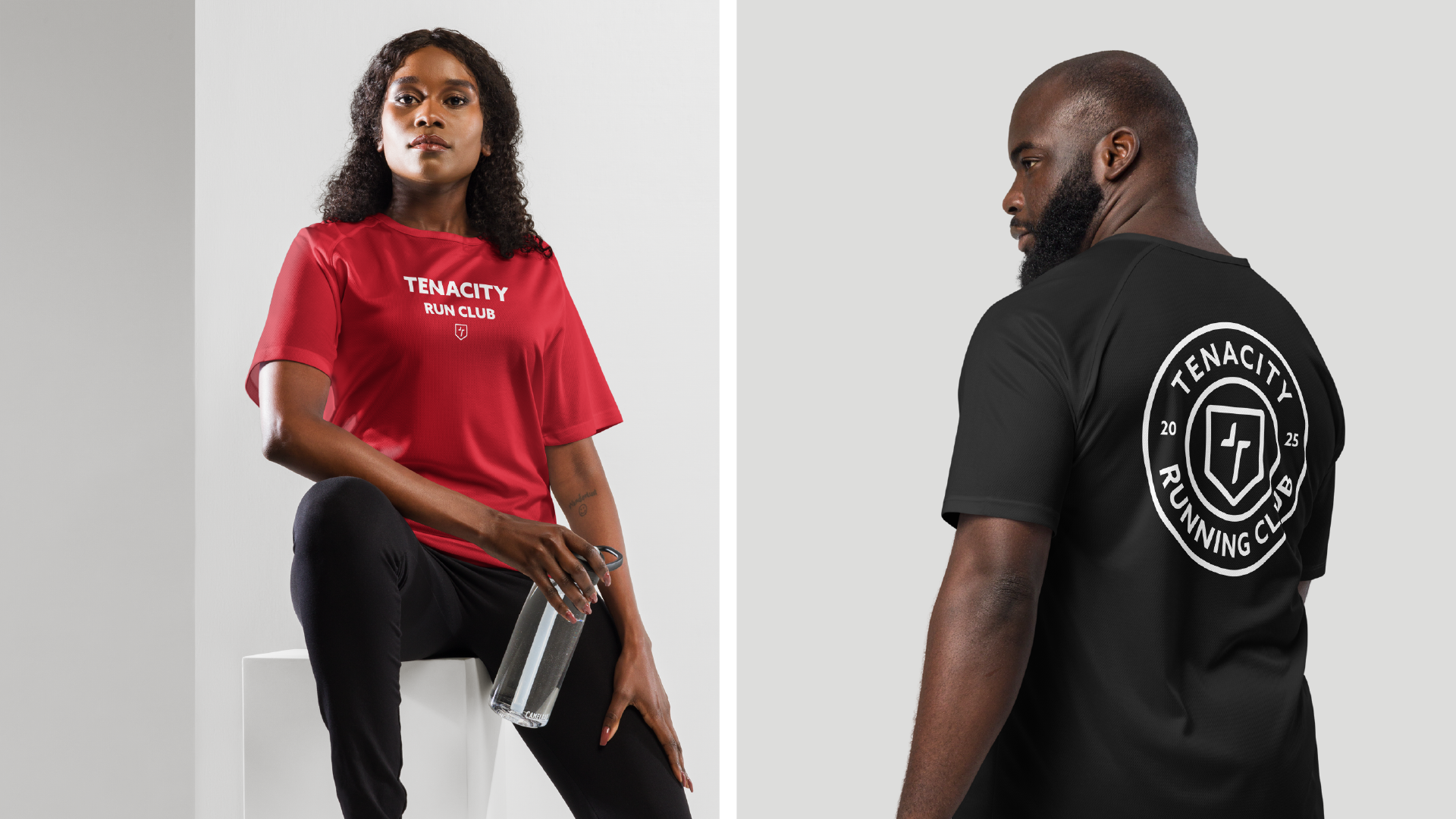
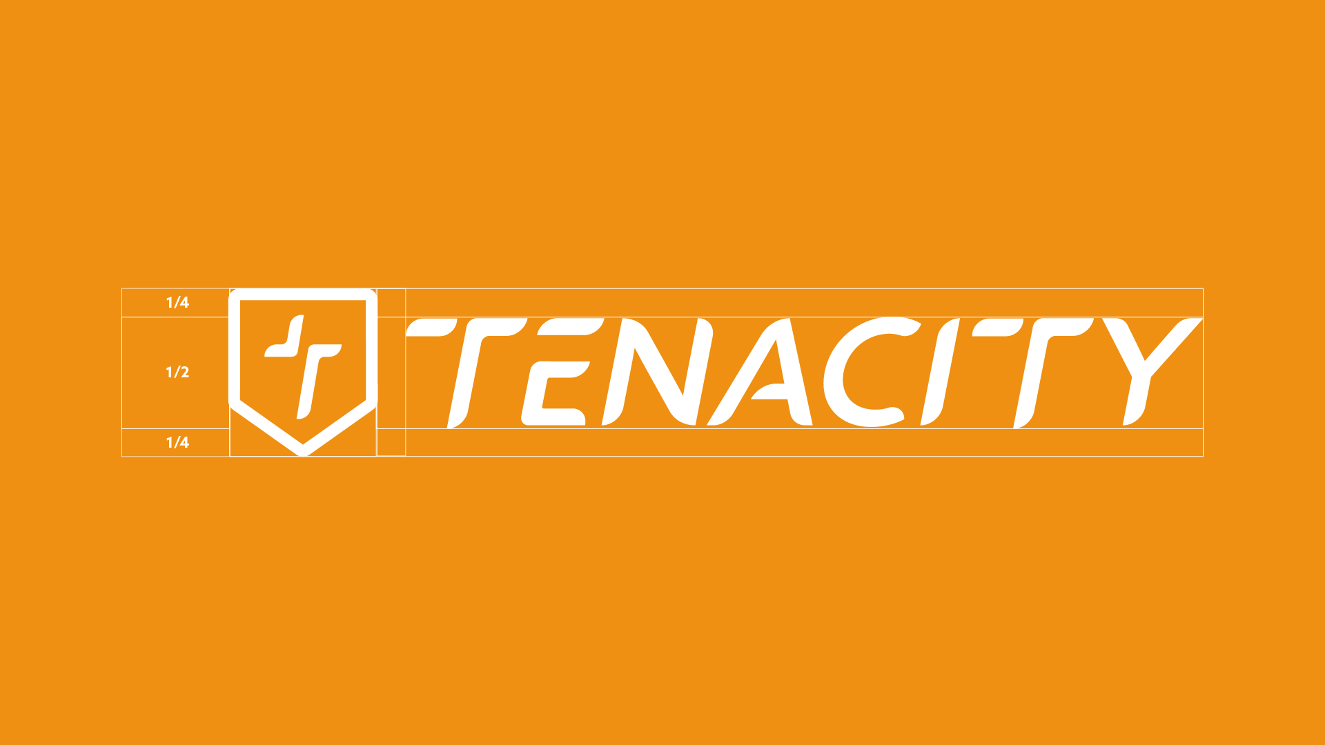
For the logo, I really leaned into symbols that convey protection and inner strength. The shield was a perfect fit, beautifully representing protection and the ongoing fight against mental health challenges. Then there's the sword, I designed it so that it also cleverly forms the letter "T" from Tenacity. This element really embodies the fight and the drive to push your limits, to strive and be the best version of yourself, day in and day out.
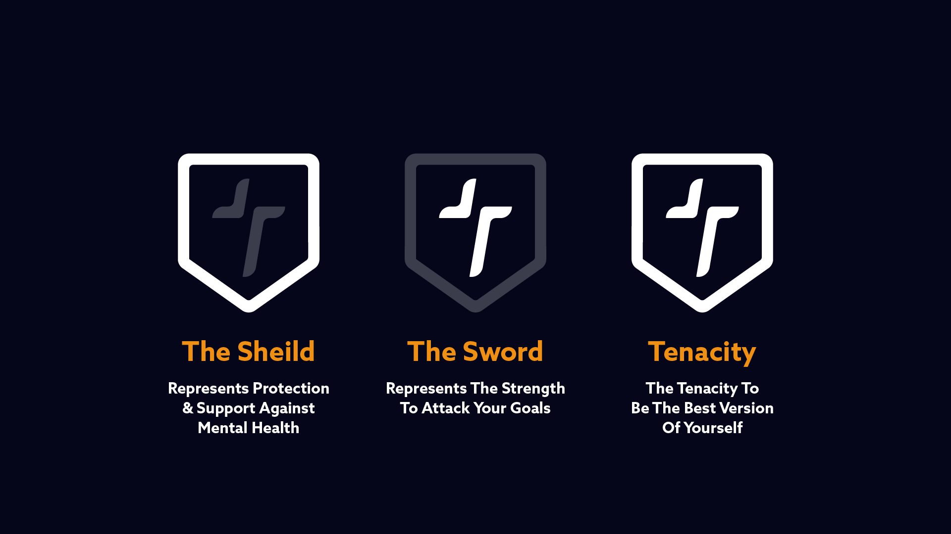
Tenacity Sportswear
TRUE STRENGTH ENCOMPASES BOTH A HEALTHY BODY & A RESILLIANT MIND!
BRAND KEY WORDS
01
Athletic
02
Resilliance
03
Community
04
Mental Health
FINAL SAY
“Working with you was amazing. You just got what Tenacity was all about from the start. The whole process felt super easy and collaborative, and the end result couldn’t represent the brand better!”
Ben Knight
Tenacity Sportswear Founder
If you like what you have seen and want to work with me, why not get in touch by clicking the link below and filling out a contact form.