

Salut! The modern and contemporary coffee brand for the coffee lover who not only enjoyed good coffee but the company they share it with.
Salut is built for a new generation of coffee drinkers who value exceptional quality, thoughtful design and brands with real personality. It's confident without being intimidating.
A coffee brand that people remember!
Salut Coffee
Client
Salut Coffee
Year
2026
Logo Design
Brand Indentity
Visual Identity
The Origin
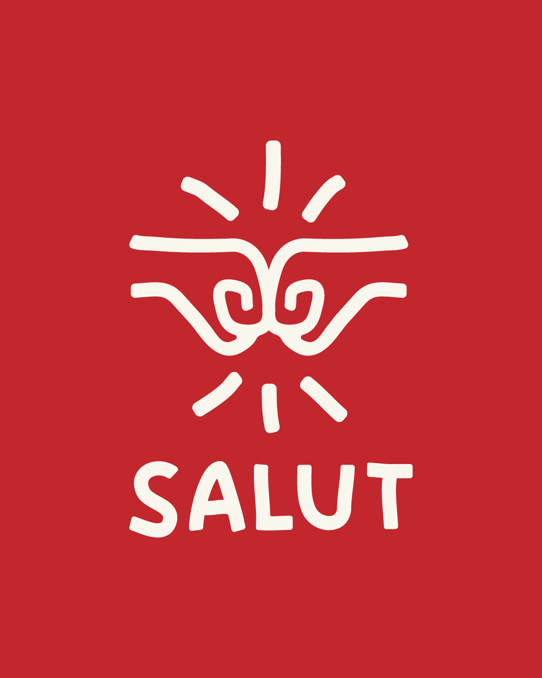
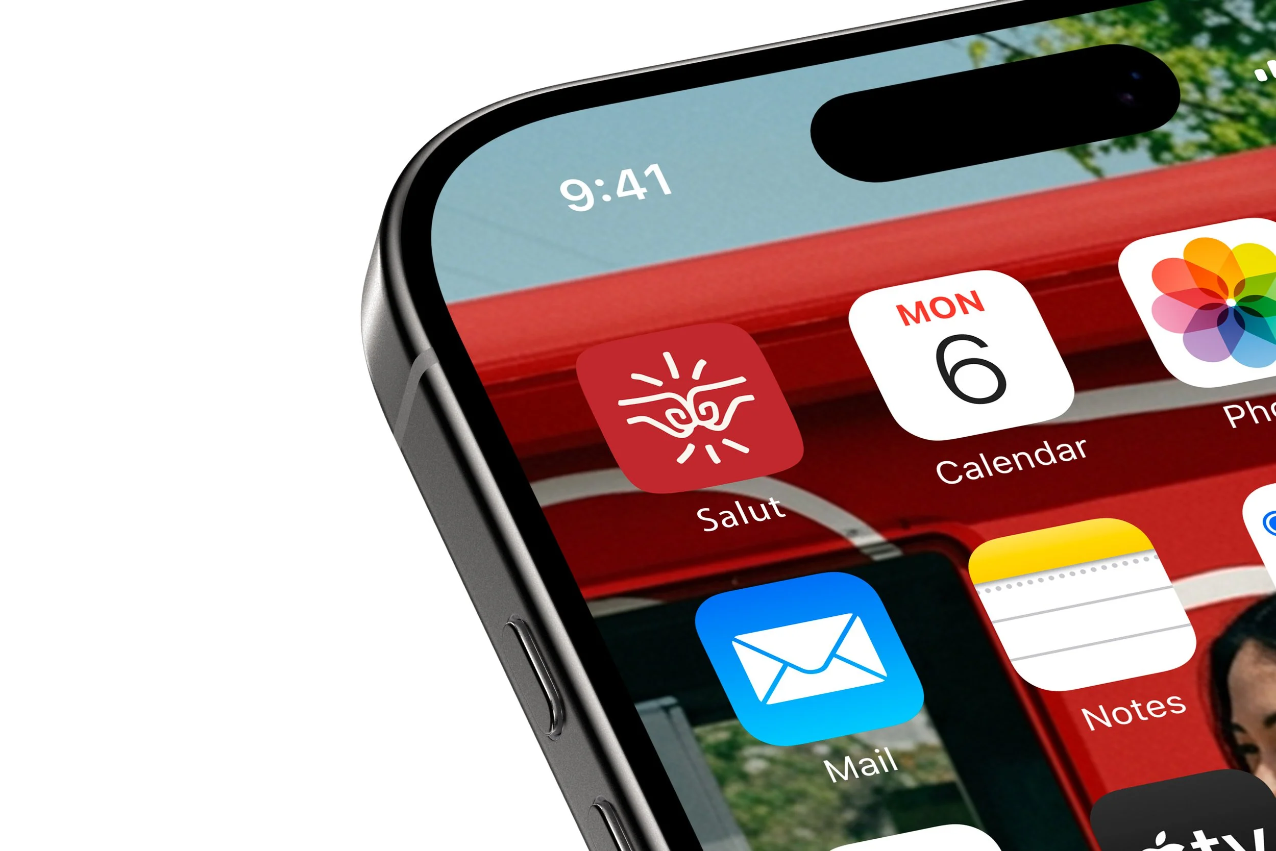
Salut means "Hi" or "Hello, one of the first words exchanged when people come together. That simple greeting became the starting point for the entire brand. While greetings have evolved over time, the intention behind them hasn't. We've traded formal handshakes for casual fist bumps, but the feeling of connection remains the same.
Salut is designed to celebrate those everyday rituals: meeting a friend, grabbing a great coffee, sharing a fist bump and saying, "Salut!" Because sometimes the smallest moments are the ones that bring us closest together.
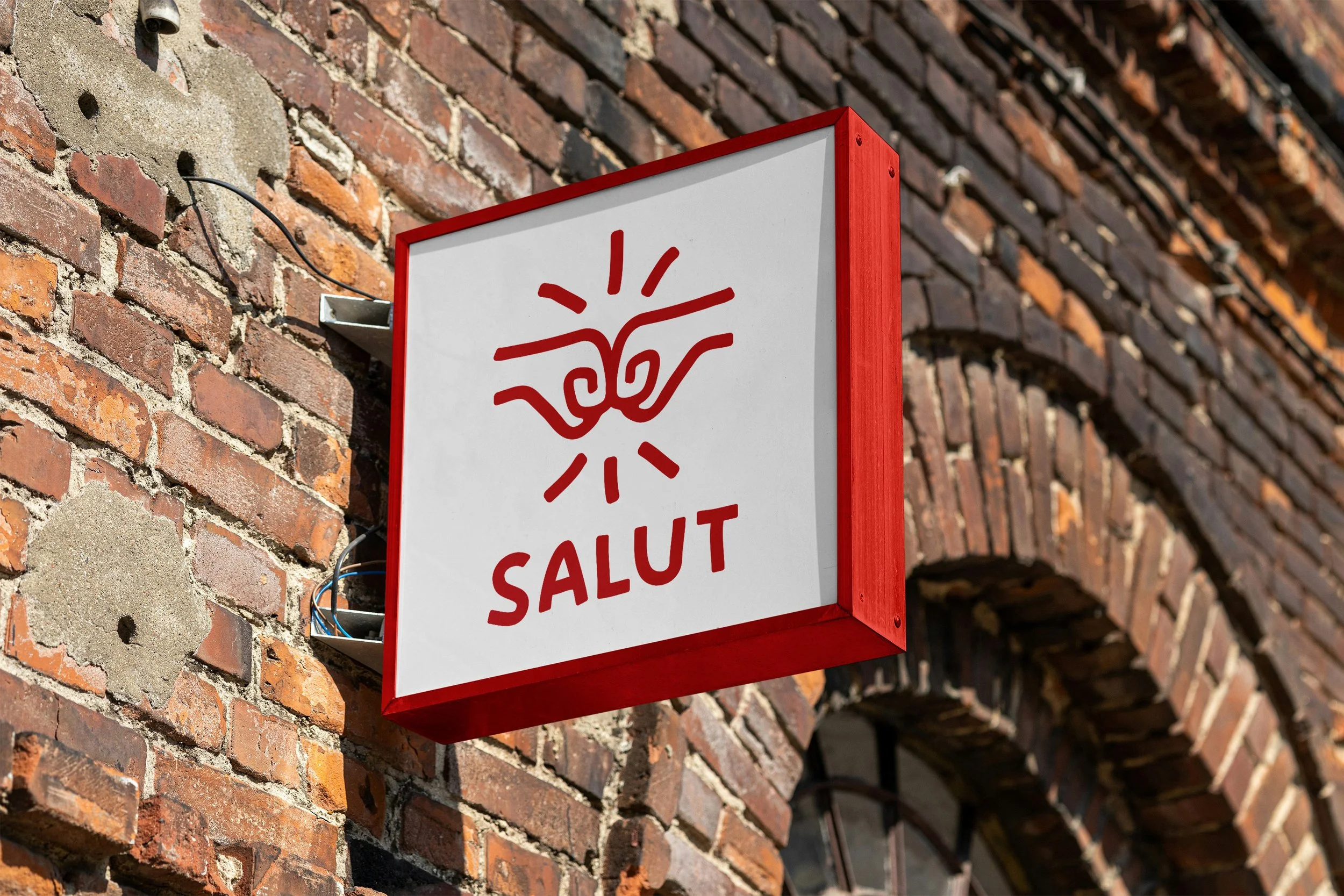
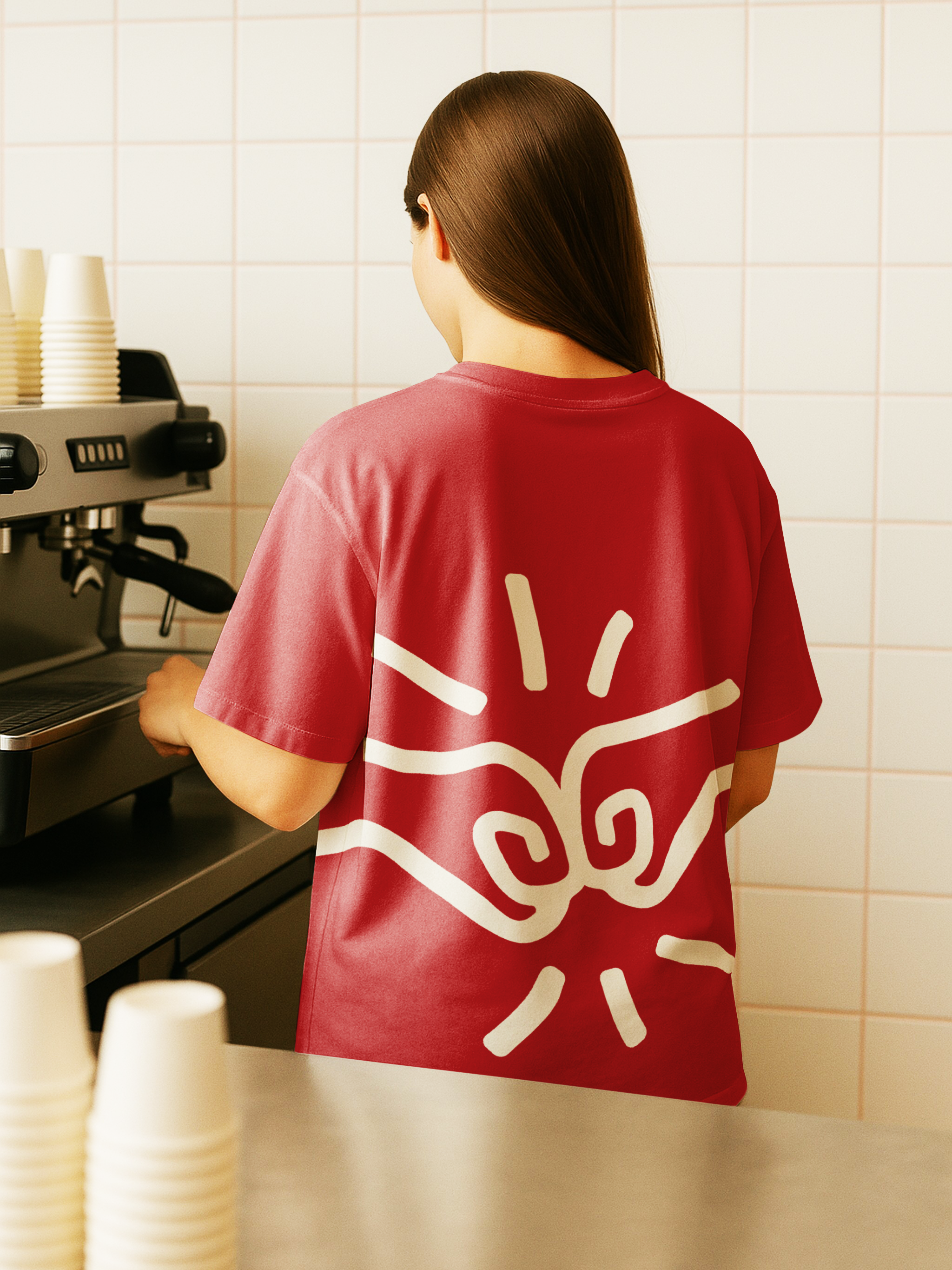
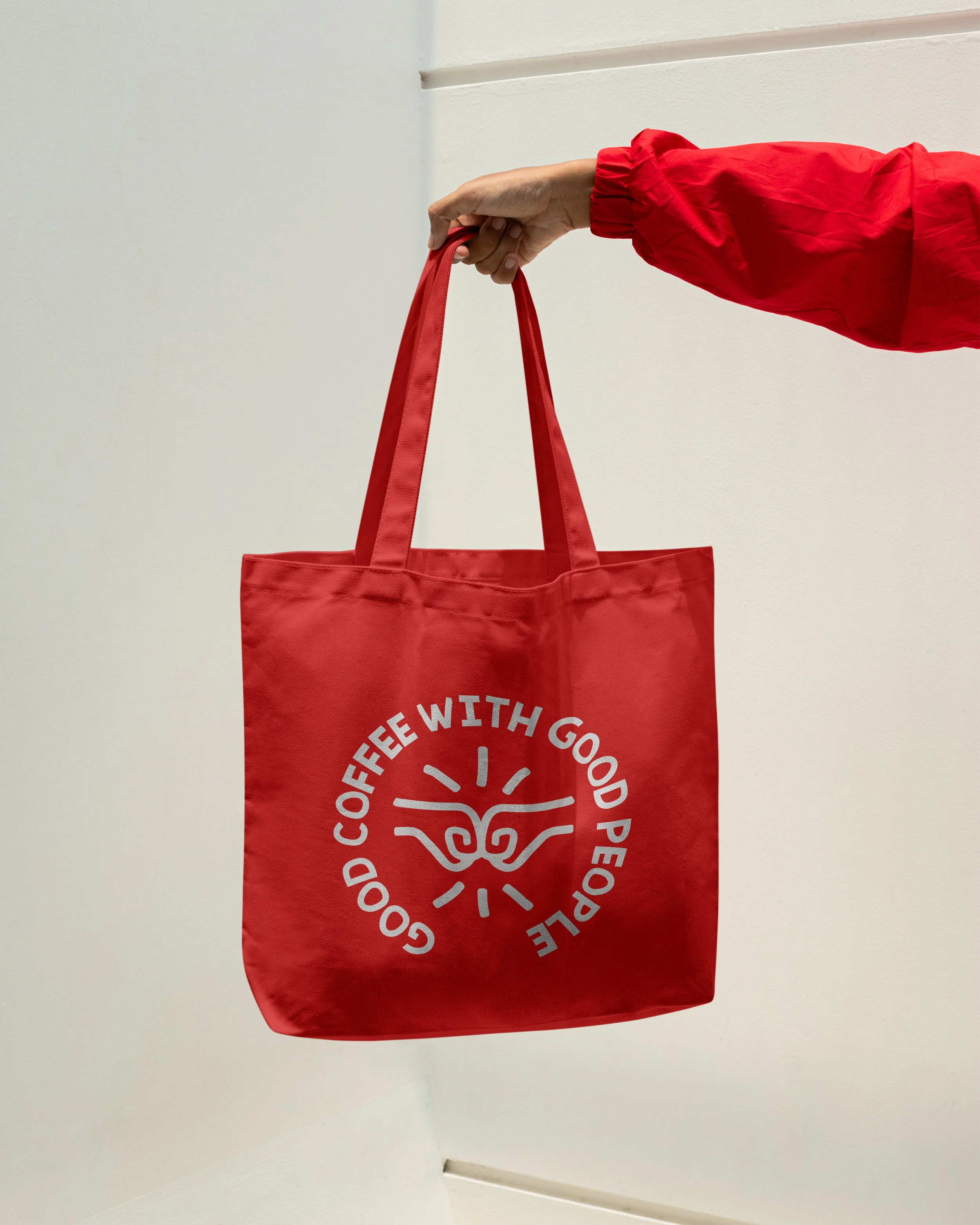
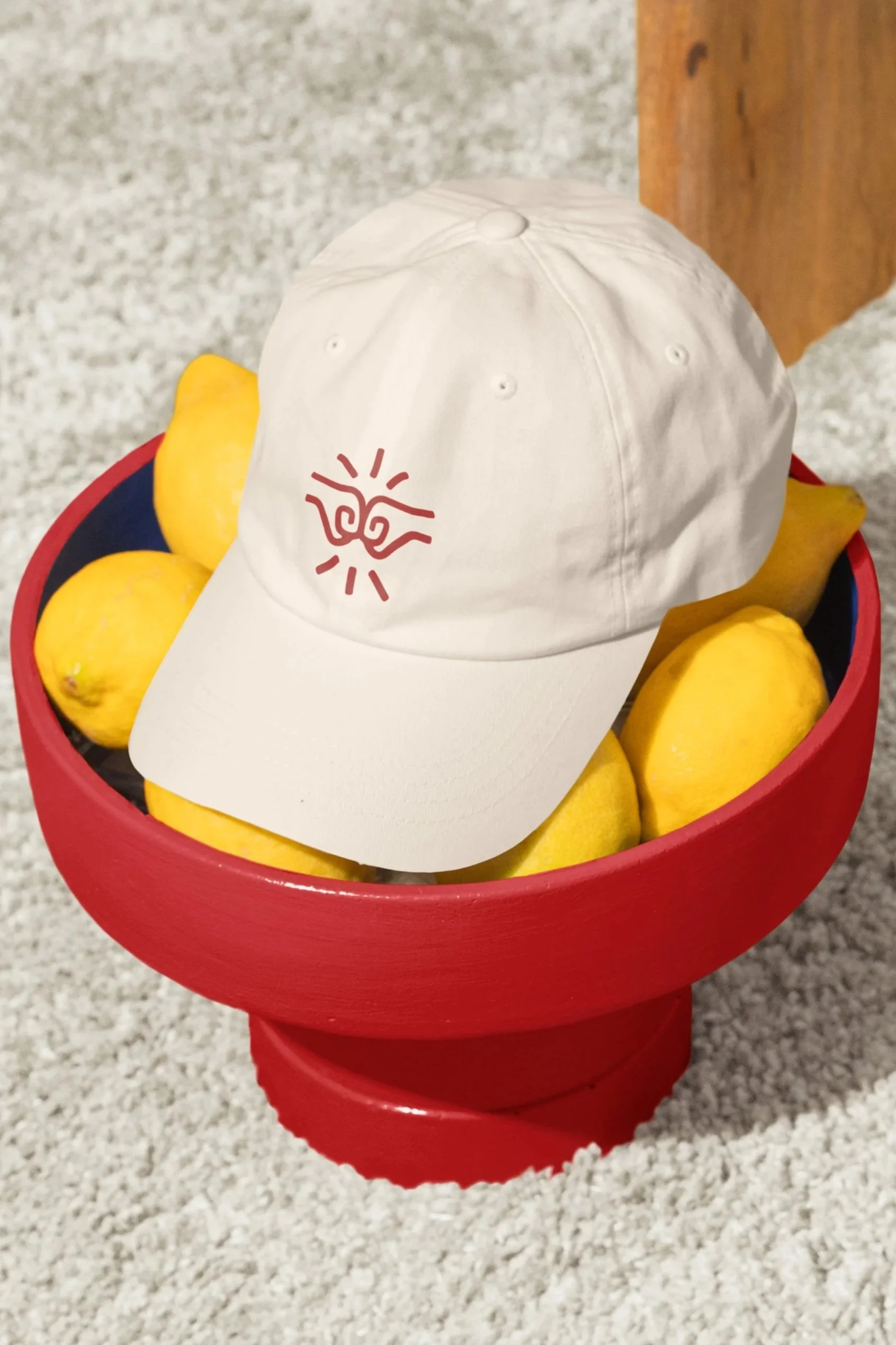
The logo captures the moment of connection through two fists meeting in a fist bump. On its own, the symbol simply represents two fists touching, but it lacked the sense of energy and movement that defines the gesture itself. By introducing subtle motion lines, the logo feels alive—as though it's frozen in the exact moment of impact. This simple addition transforms a static icon into one that communicates warmth, interaction and human connection, reinforcing the brand's purpose of bringing people together.
The Logo

BRAND KEY WORDS
01
Friendly
02
Modern
03
Minimal
04
Bold
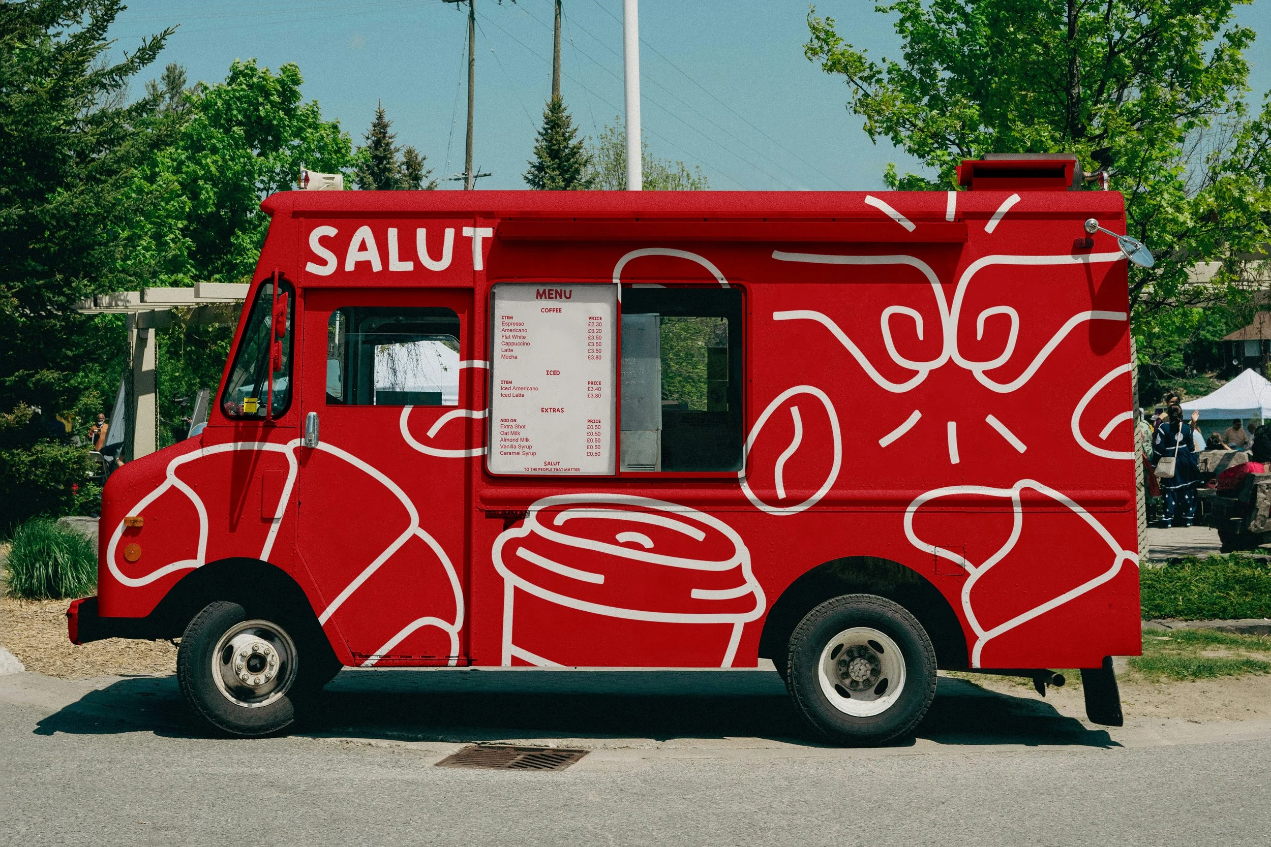
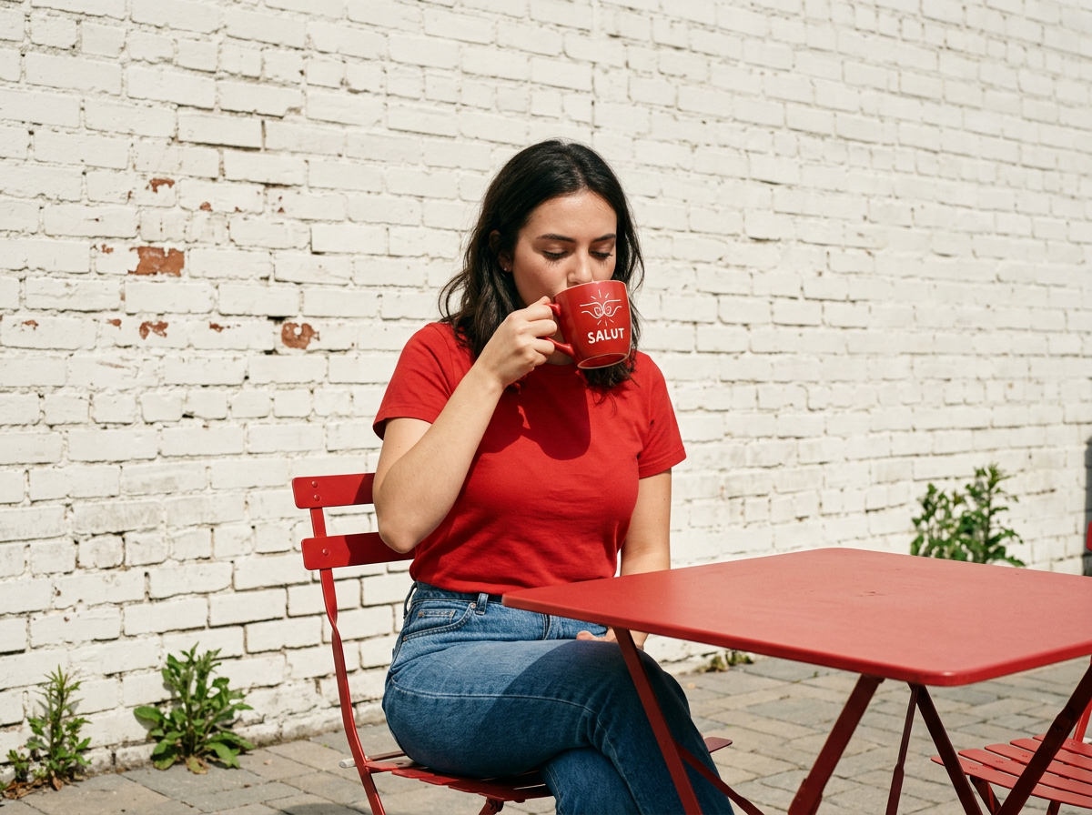
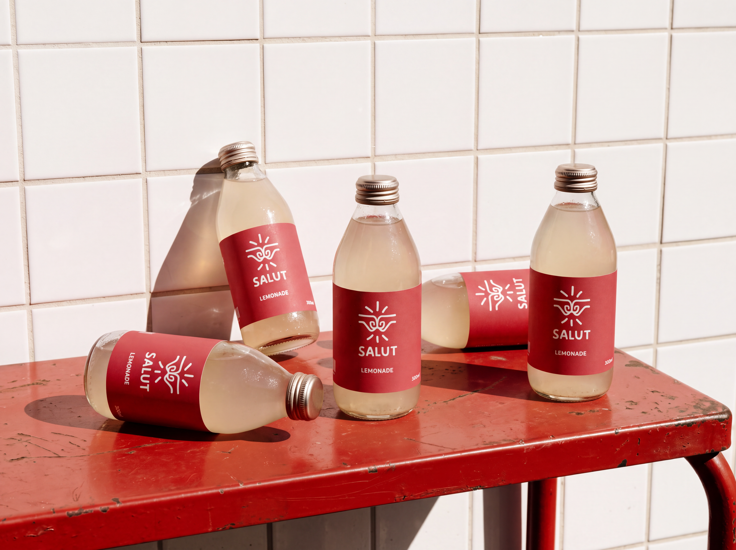
The brief was to create a brand that felt bold, memorable and instantly recognisable. Rather than relying on complexity, the identity achieves this through simplicity. A striking red is paired with a soft coffee-foam white, creating a confident two-tone palette with strong contrast and immediate visual impact. It's proof that a brand doesn't need an extensive colour palette to stand out—it simply needs to use what it has with purpose.
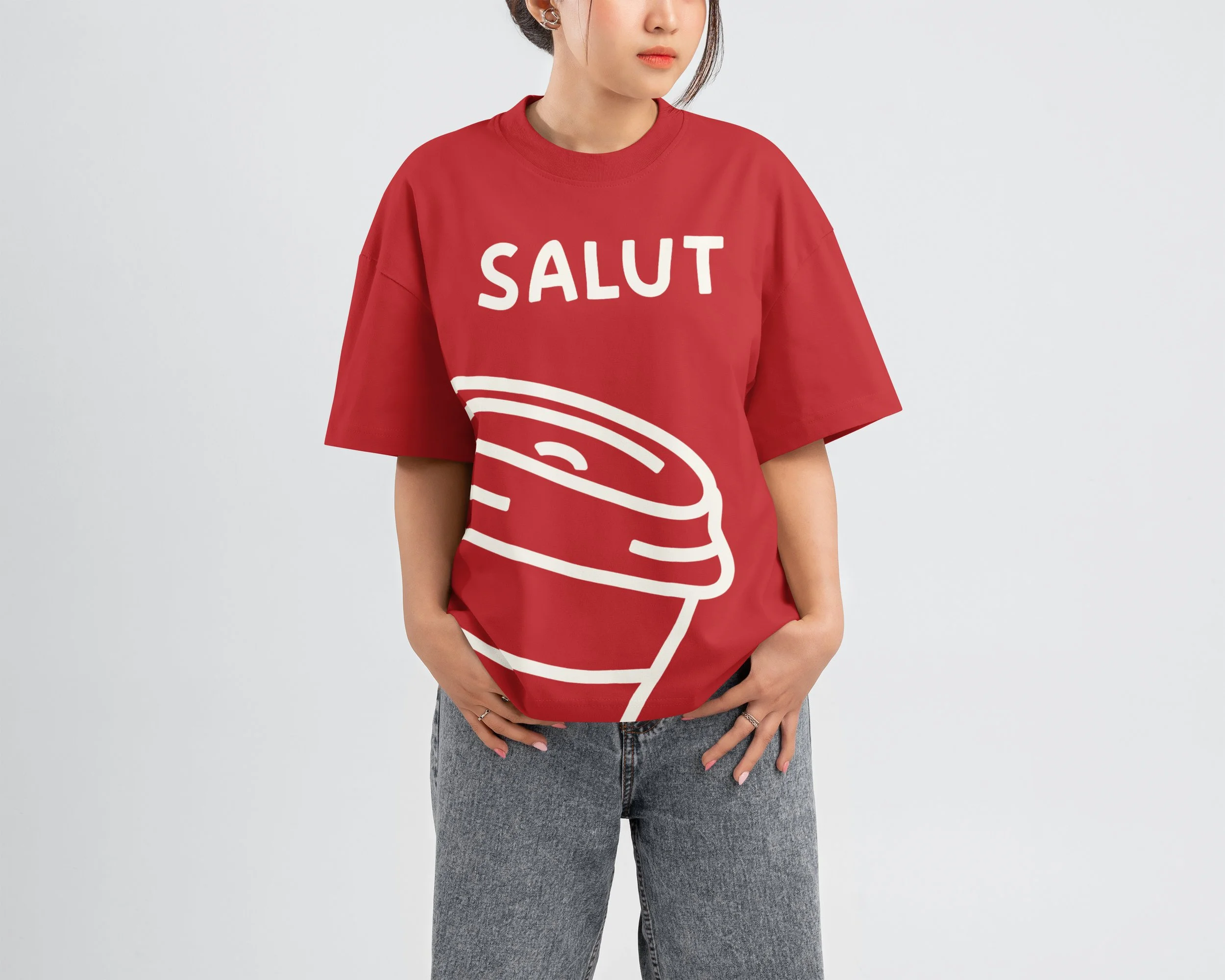
Complementing the palette is a custom typographic system that gives Salut its personality. The letterforms are playful and approachable, reflecting the relaxed nature of meeting friends for a coffee, while remaining clean and considered. Together, the typography and colour work in harmony to create a brand that feels warm, confident and full of character without ever feeling overdesigned. The result is an identity that is bold in appearance, effortless in execution, and built around the simple joy of getting together over great coffee.
The Colours Scheme:




FINAL SAY
Salut is about bring people together. A brand built on a greeting. This visual identity is focused around that connection. The moment you bump firsts with your mate. It is bold, it is loud but it’s simple in its own right.
Aaron Moriarty
93 Design Studio
If you like what you have seen and want to work with me, why not get in touch by clicking the link below and filling out a contact form.