
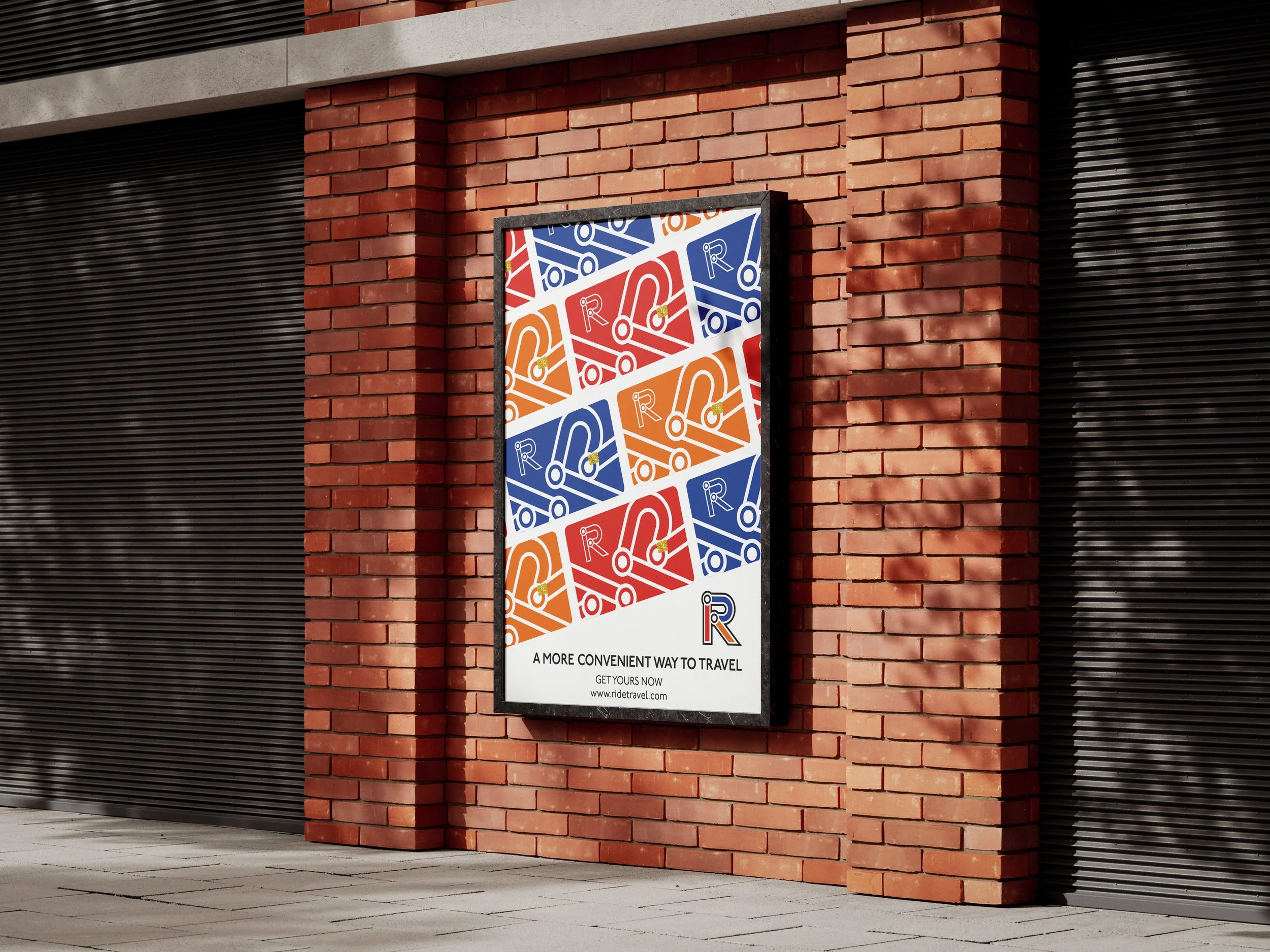
RIDE NATIONAL TRANSPORT
RIDE is a national transport concept that simplyfies travel.
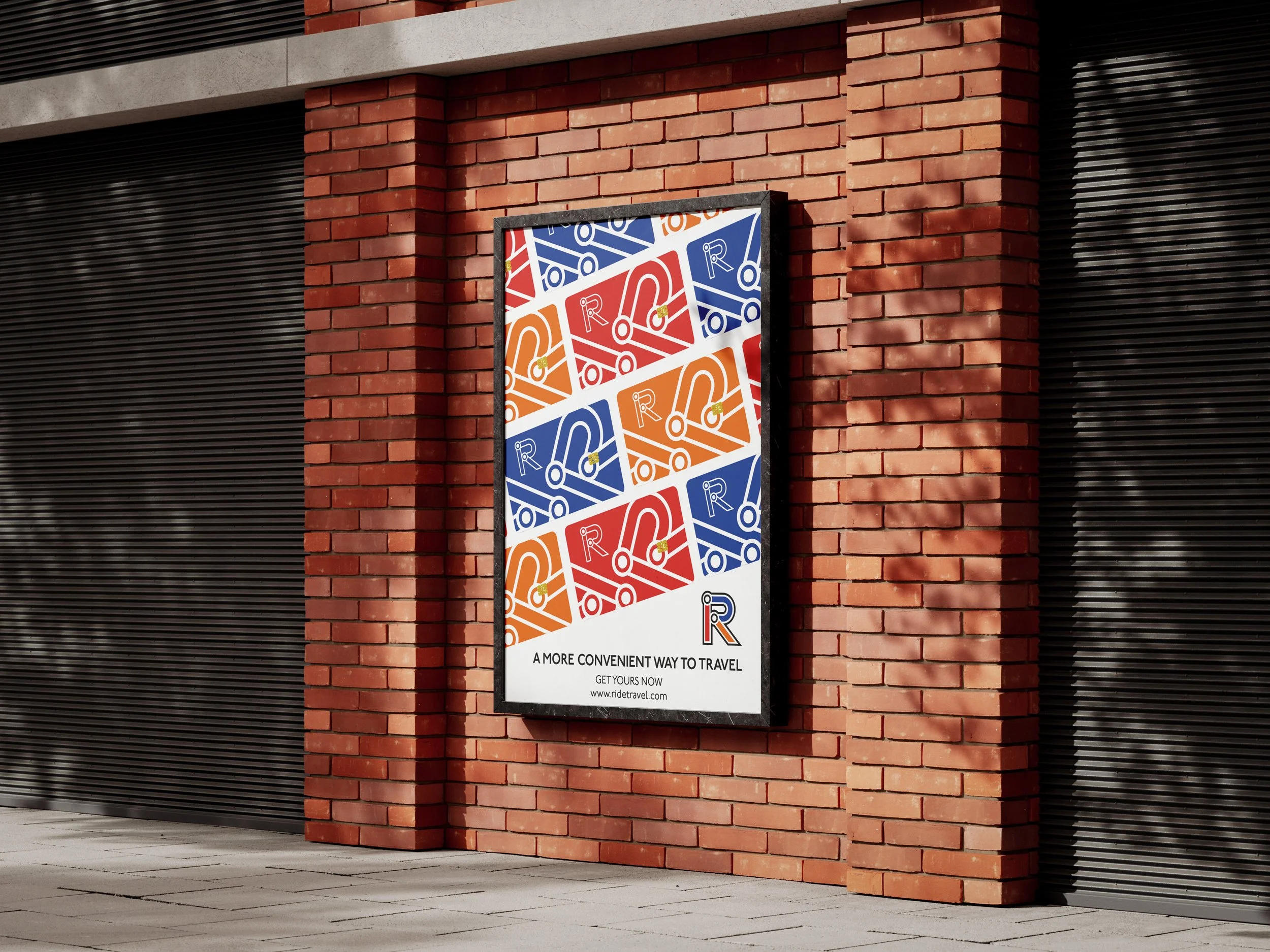
RIDE is a revolutionary national transport concept designed to streamline and simplify travel. It brings all your travel needs into one convenient platform. Whether booking a train ticket, storing your bus pass, or accessing your metro or underground tickets, RIDE has you covered.
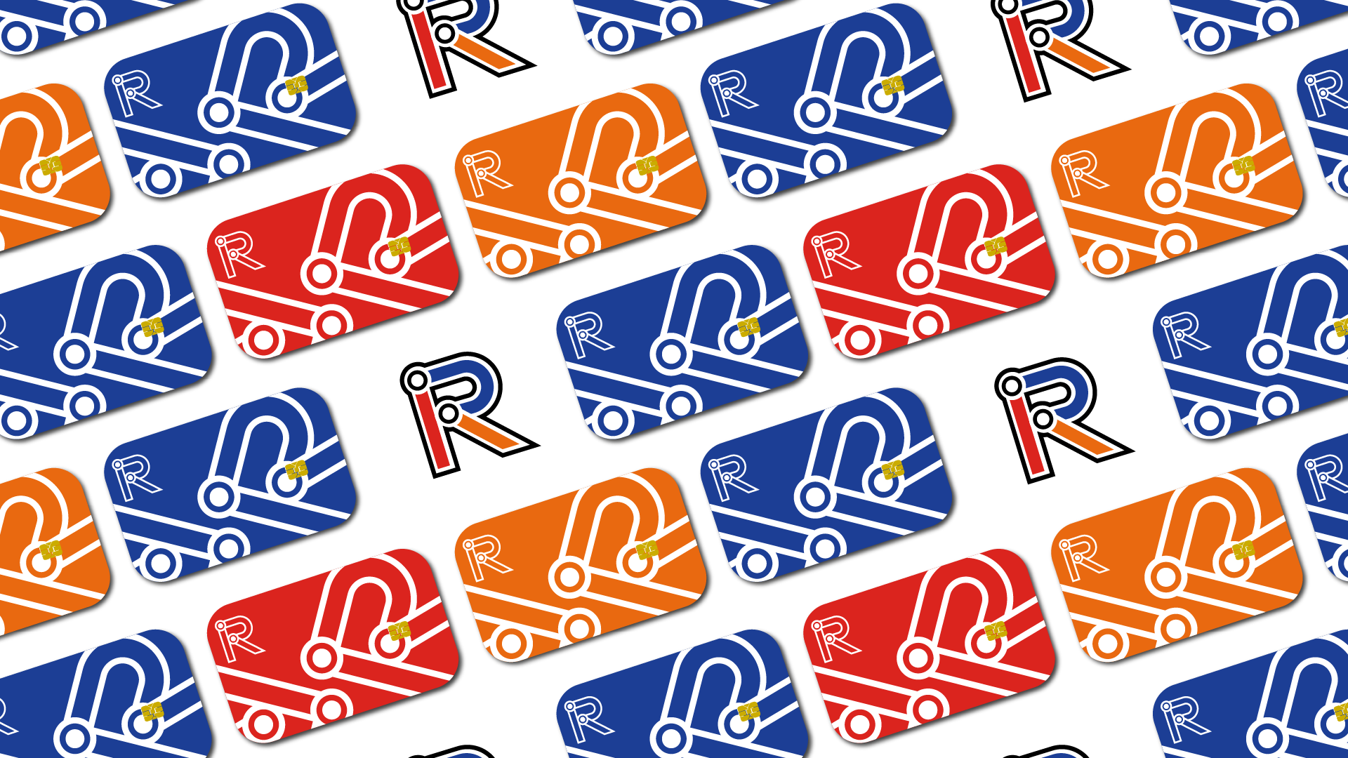
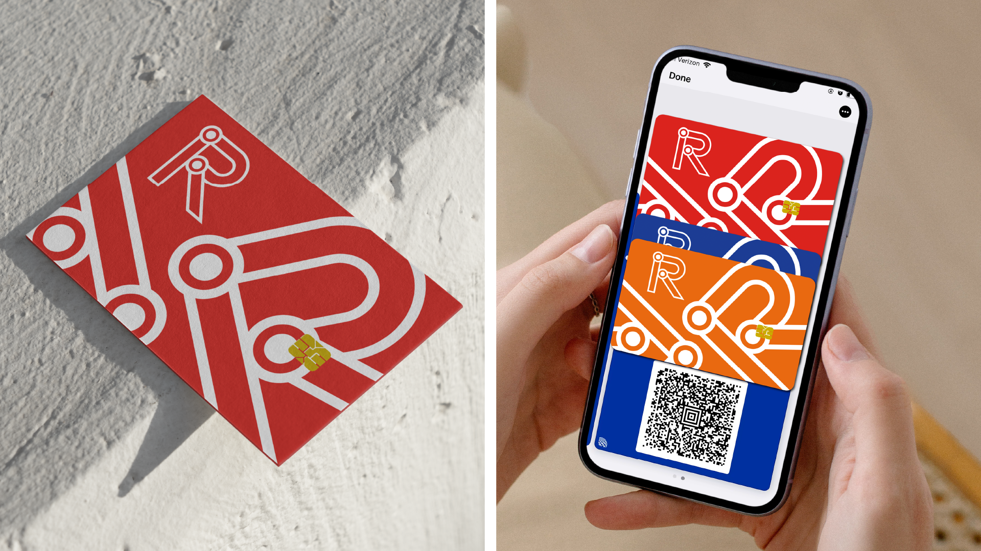
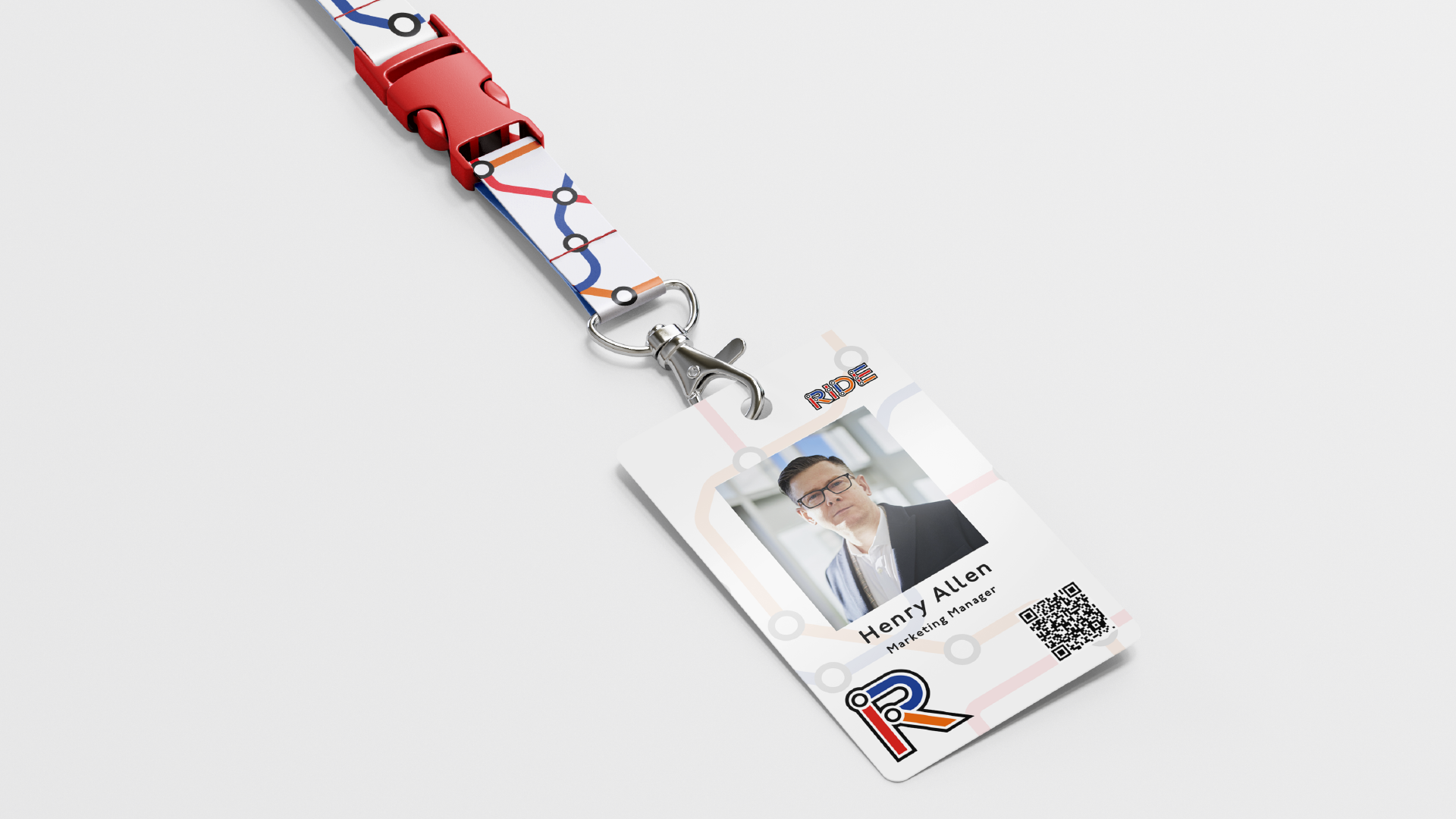
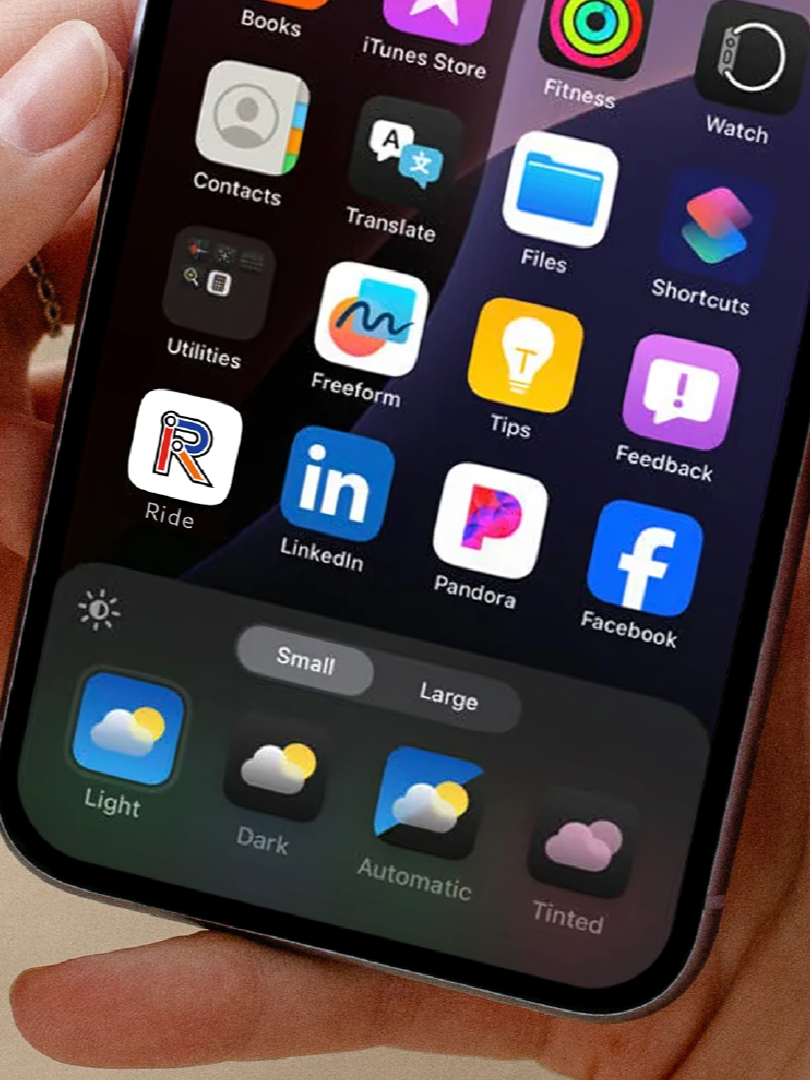
No more shuffling through multiple tickets or queuing for collections. RIDE makes travel seamless. Simply book your journey through the RIDE app, and your RIDE card becomes your all-access pass. The card integrates with Apple/Google Wallet for digital convenience or is available as a physical card for those who prefer a tangible option.
Logo Design
Brand Indentity
Client
Ride National Transport
Year
2025
The Origin
The concept behind this project came about during a trip to my dads. I had to take a National Rail train to London, then the tube to paddington before another National Rail service to Bath Spa followed by a bus from the station. This resulted in needing 3 different tickets. But why did I need 3 tickets for this? Wouldnt it be easier to just have 1 and tap on each service. That inspired the concept of RIDE. To simplify national transportaton.
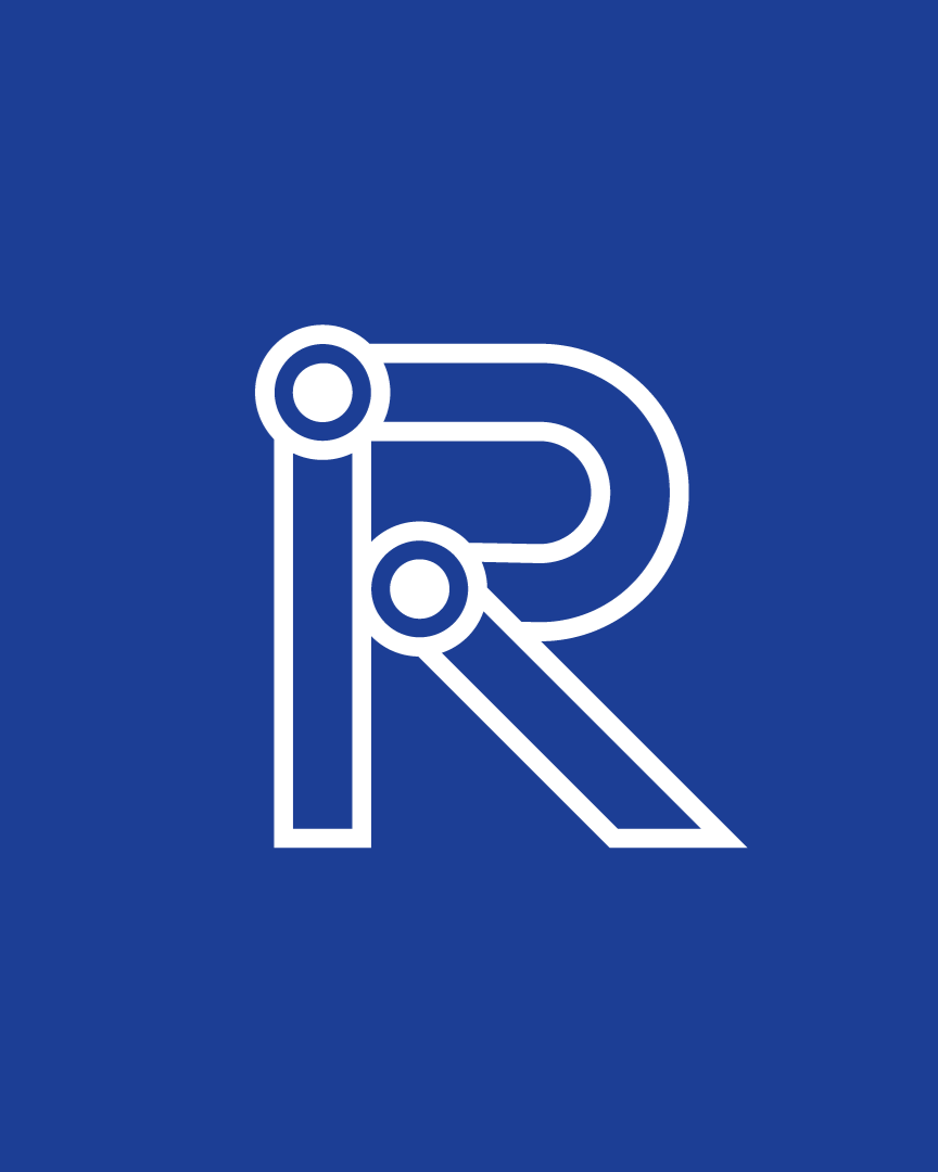
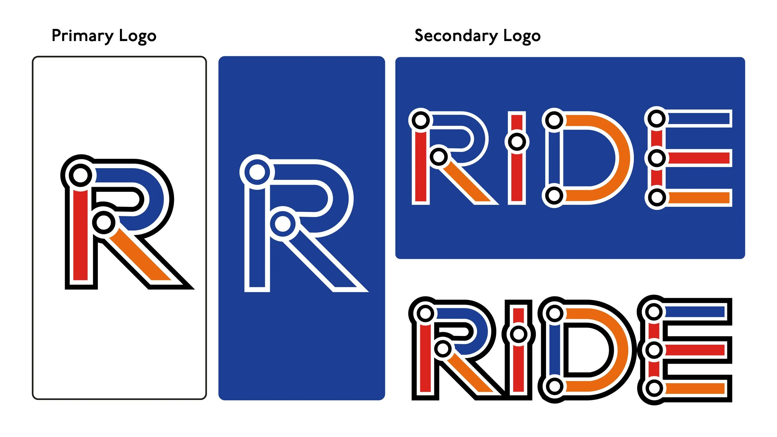
I took huge inspiration from the TFL and the London Underground to create the logo. I really wanted something to showcased connectivity and travel and what better way to utalise this by creating an ‘R’ that looks like stations and routes form the London Tube Map. it works both in colour and mono formats and i think really represents what RIDE is trying to do and that make national travel easier and connecting different cities together with out the need for multiple tickets.
The Logo
BRAND KEY WORDS
01
Connectivity
02
Simplicity
03
Convenience
04
Hassle Free
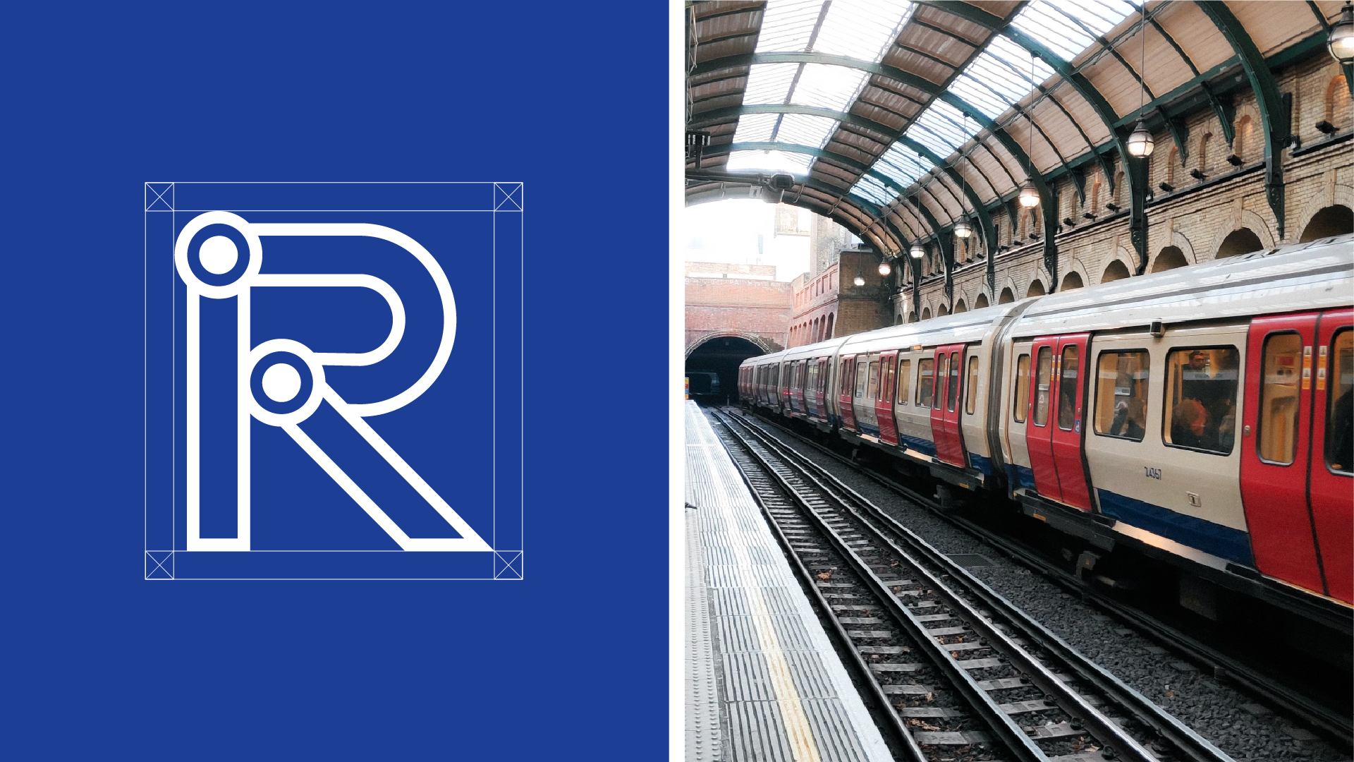
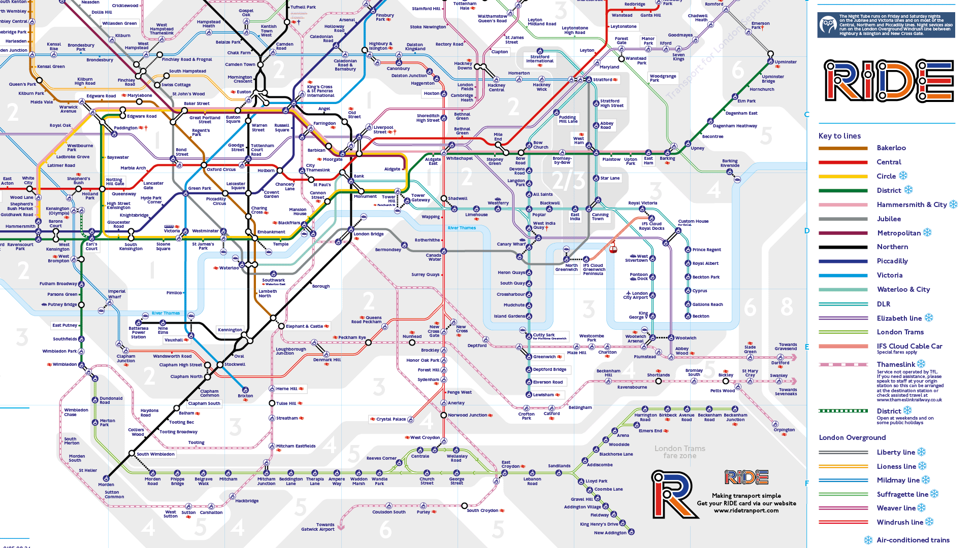
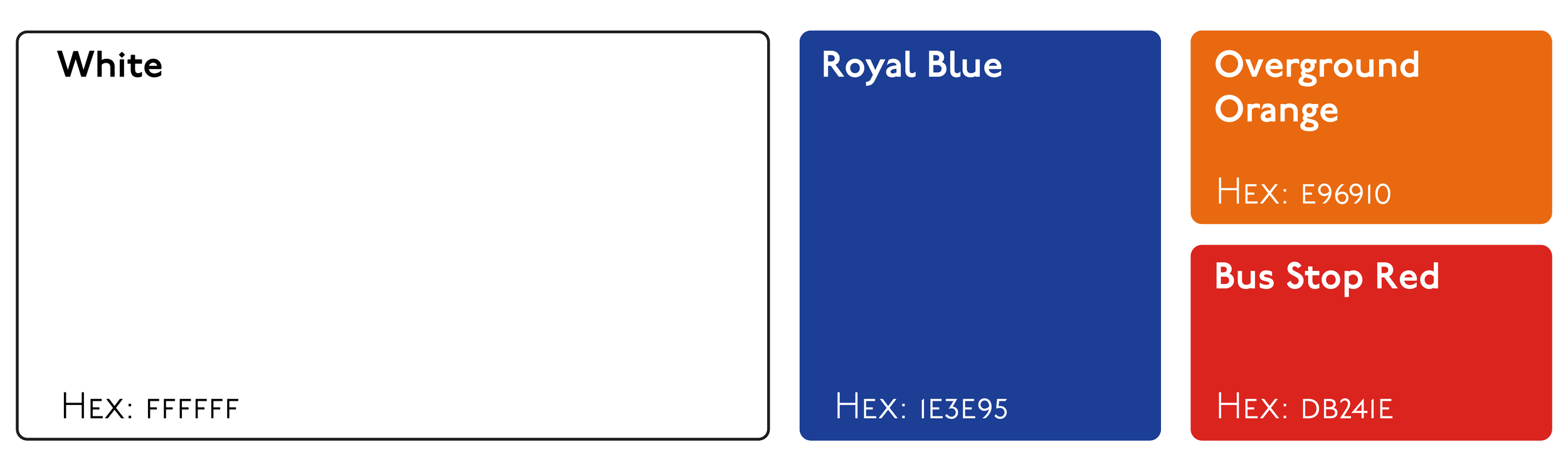
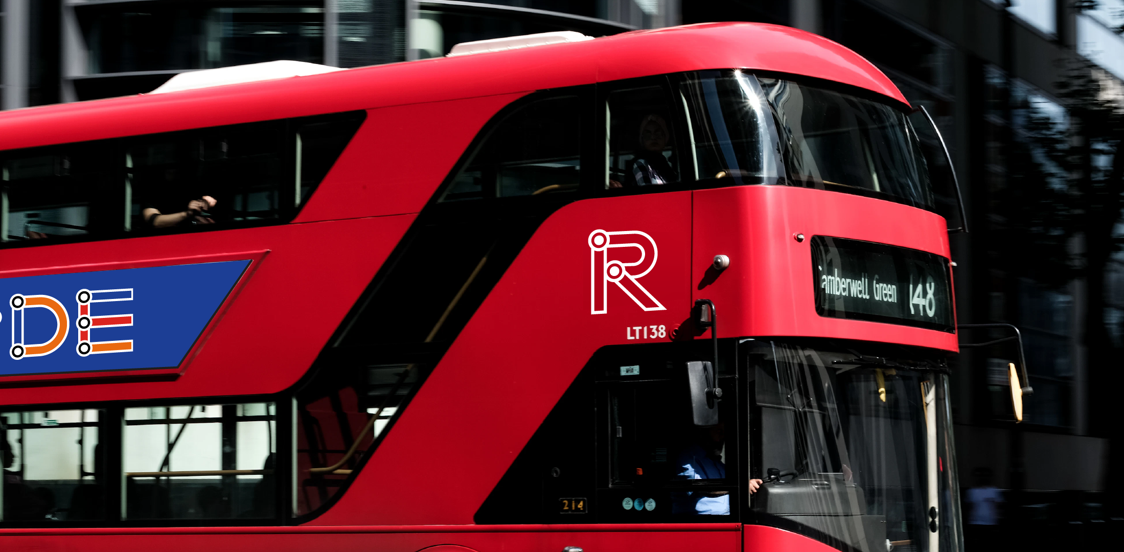
The Colour Scheme is heavily inspired by the TFL London Tube Map. It is one of the most recogniseable maps in the world. The iconic red London buses or as we call in Bus Stop Red combined with a Royal Blue and Overground Orange bring a real pop of colour, it is bright and bold and really catches the eye, especially when placed on a white background. And a White mono-coloured logo placed on either of those colours really stands out creating a perfect pairing for this brand.
The Colours Scheme:
Logo Lockups:

FINAL SAY
Aaron Moriarty
93 Design Studio
“Digging through my pockets or wallet to find the right bus ticket or searching through aps to find your train ticket could be a thing of the past. Why are they all in different places? surely it makes sense to have one ticket. like an Oyster Card? but why cant i also use it in Manchester or Milton Keynes?
These thoughts are what inspired this passion project. One singlualr card that allows me to tap and go wherever I am. One that covers all forms of public transport within the UK.
If you like what you have seen and want to work with me, why not get in touch by clicking the link below and filling out a contact form.