
HOOP UNION
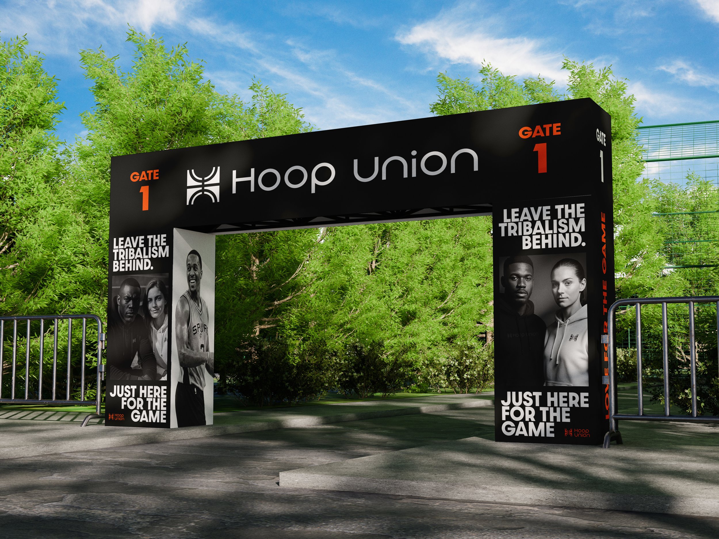
Hoop Union is a basketball apparel brand that focuses on connecting people with other players. Set your tribalism to the side and come together to play the game we love.
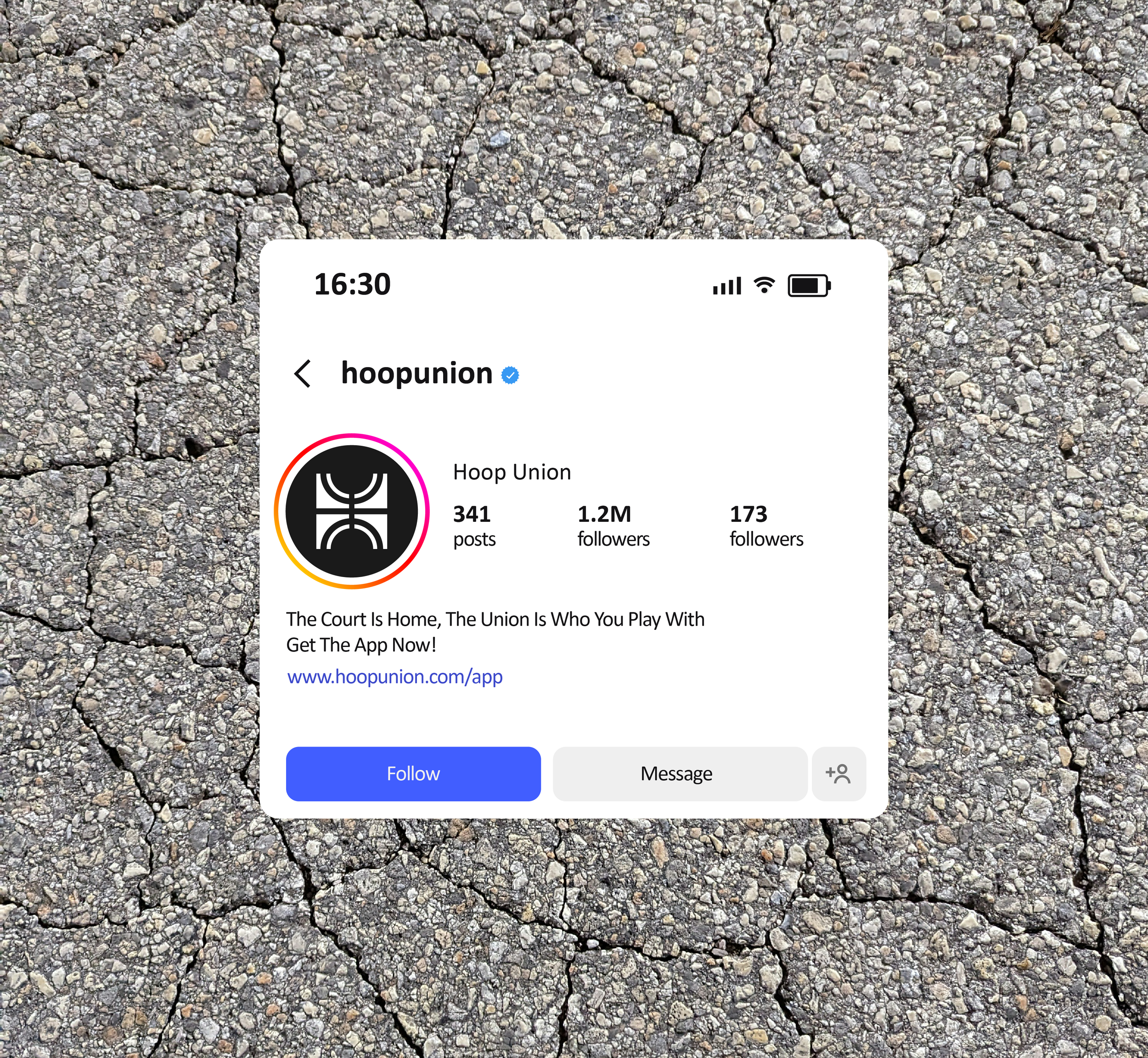
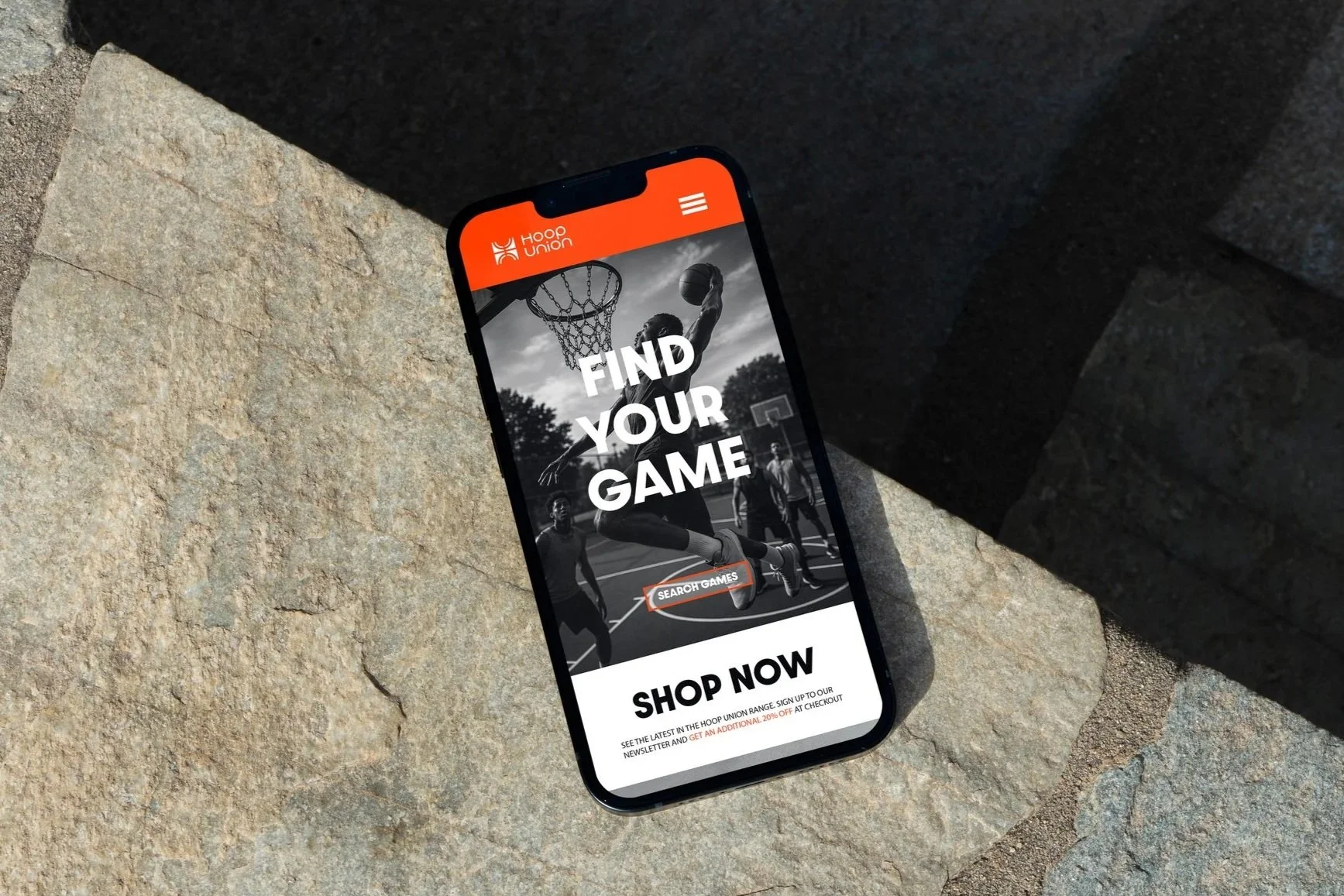
With a big focus on inclusivity Hoop Union has an app that allows everyone to find and meeting players near them. Simply download the app to see what pick-up games are going on. Maybe you want to play but have dont have enough numbers? tell people what youre looking for and invite them to the court. This is more than just an app. It’s a union!
Client
Hoop Union
Year
2026
Logo Design
Brand Indentity

This was a really fun project to work on as a lover of sports myself. I love the community that sports creates, it brings peole together from all over the world through a common love. I wanted to bring that love and community together and create a brand that truly reflect it.
The Logo
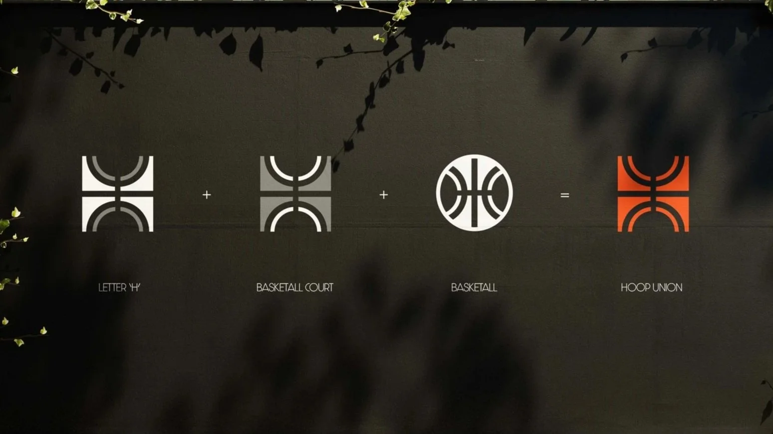
I knew from the start I wanted a logo that would be clean and could be easily identified as a basketball brand and I feel I have captured that realyl well. The ‘H’ combined with the detailing of a basketbal bring out a modern, unique but clear design that fits what Hoop Union is all about. It is clean, modern and works really well as a stand alone icon and when paird with the wordmarks too.
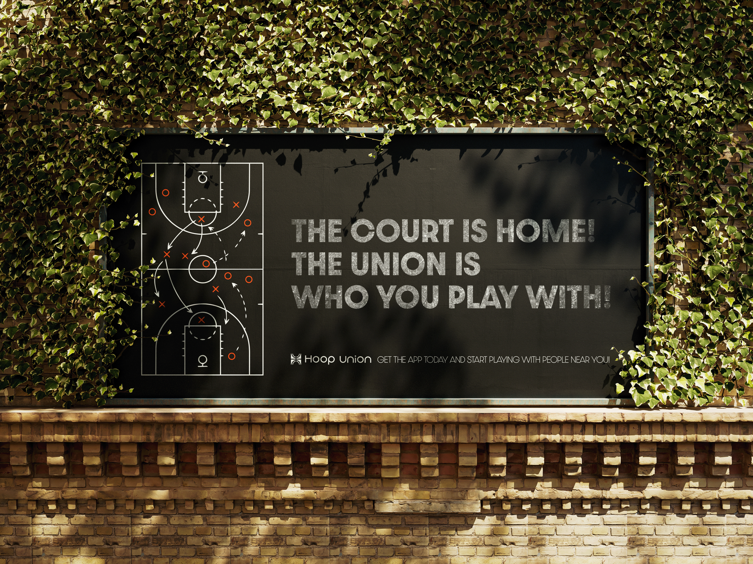
Brand Motto
THE COURT IS HOME, THE UNION IS WHO YOU PLAY WITH!
BRAND KEY WORDS
01
Athletic
02
Inclusive
03
Urban
04
Modern
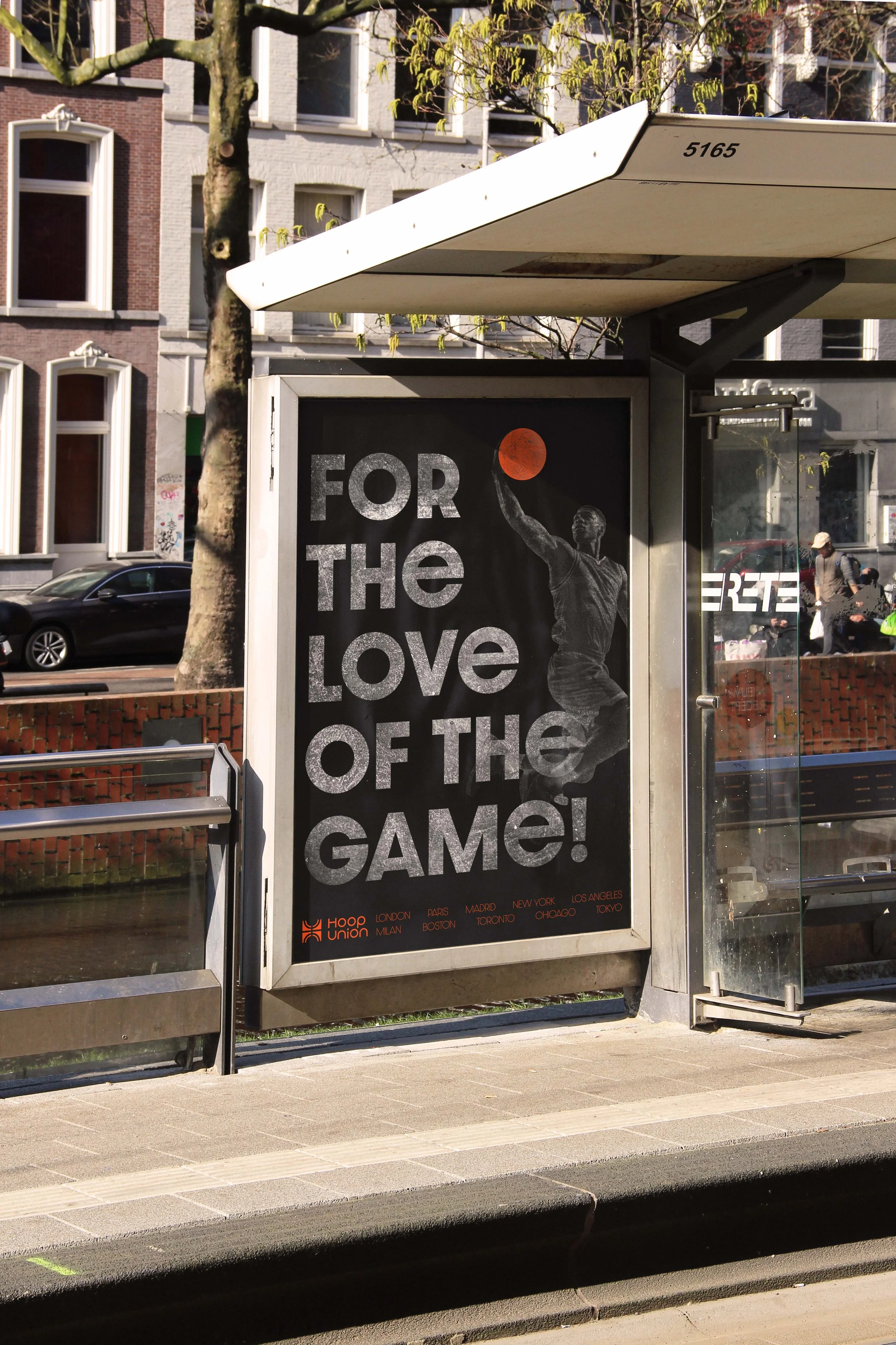
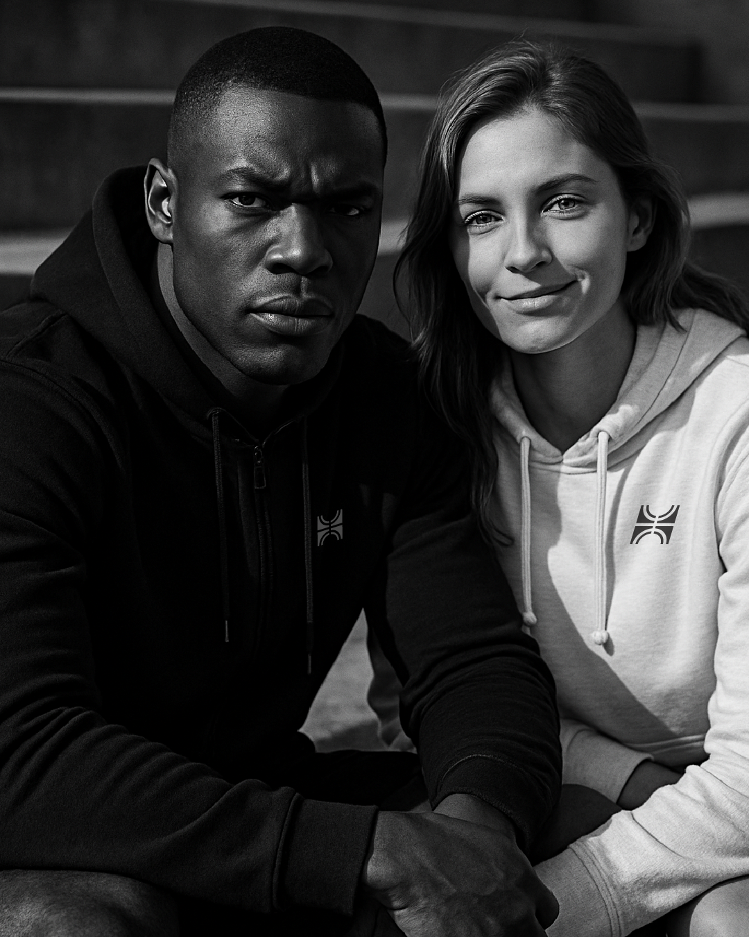
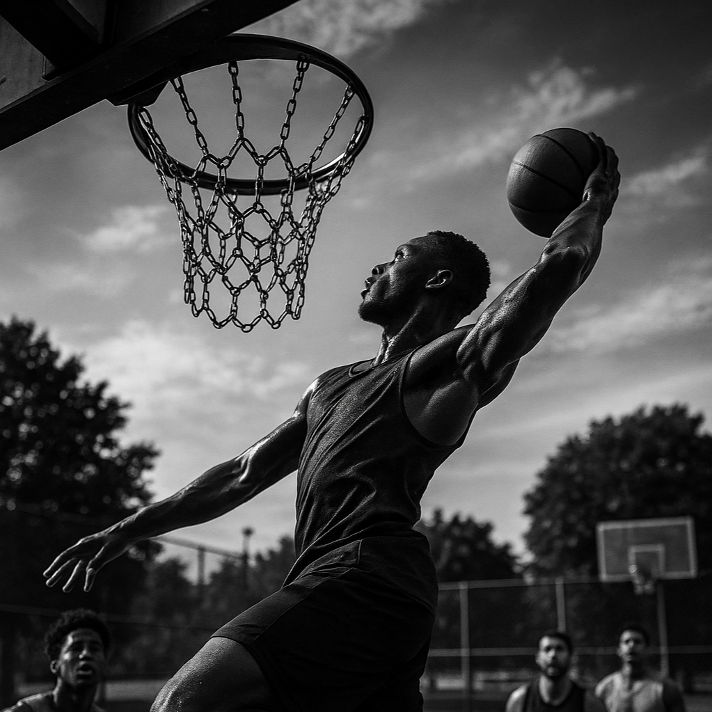
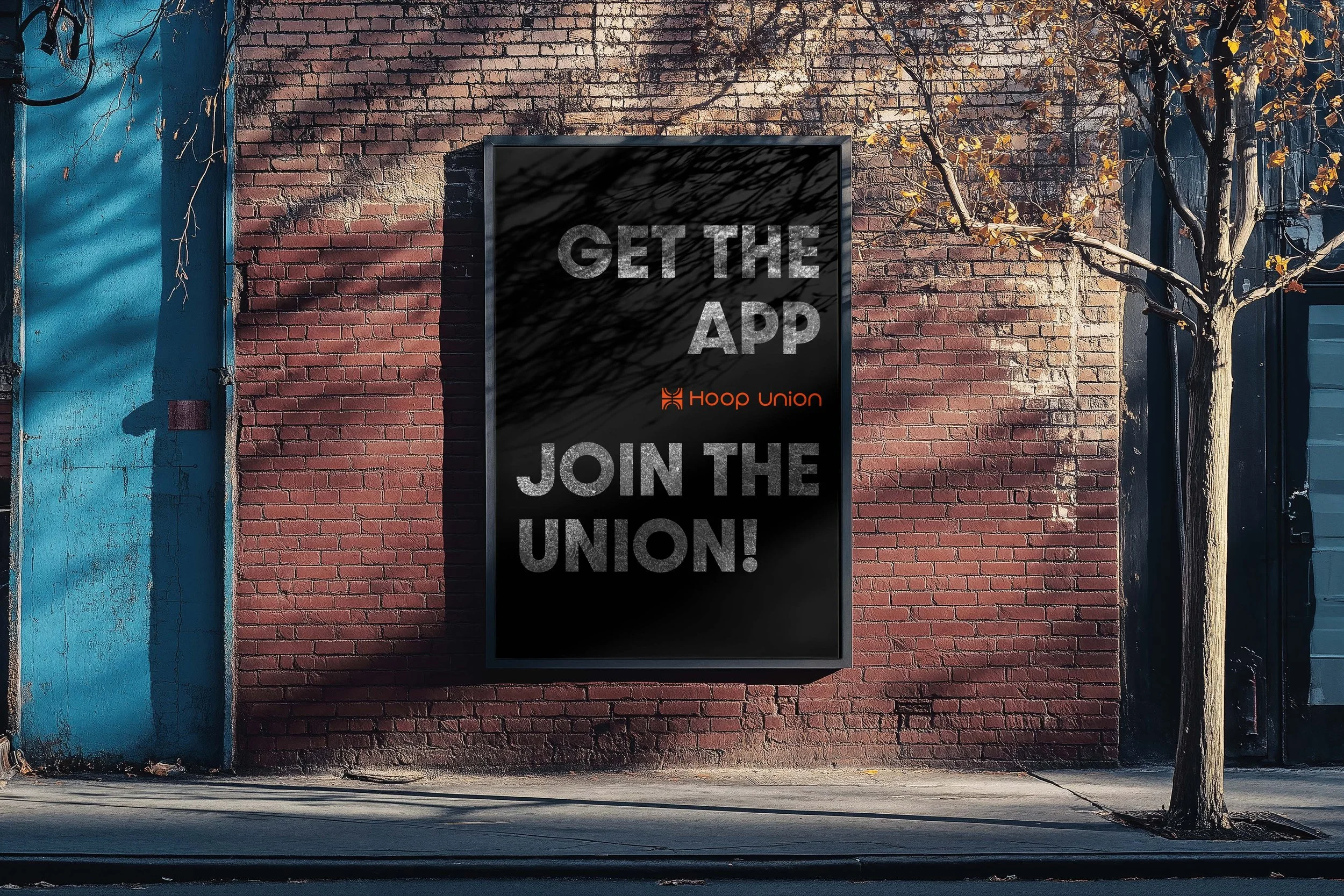

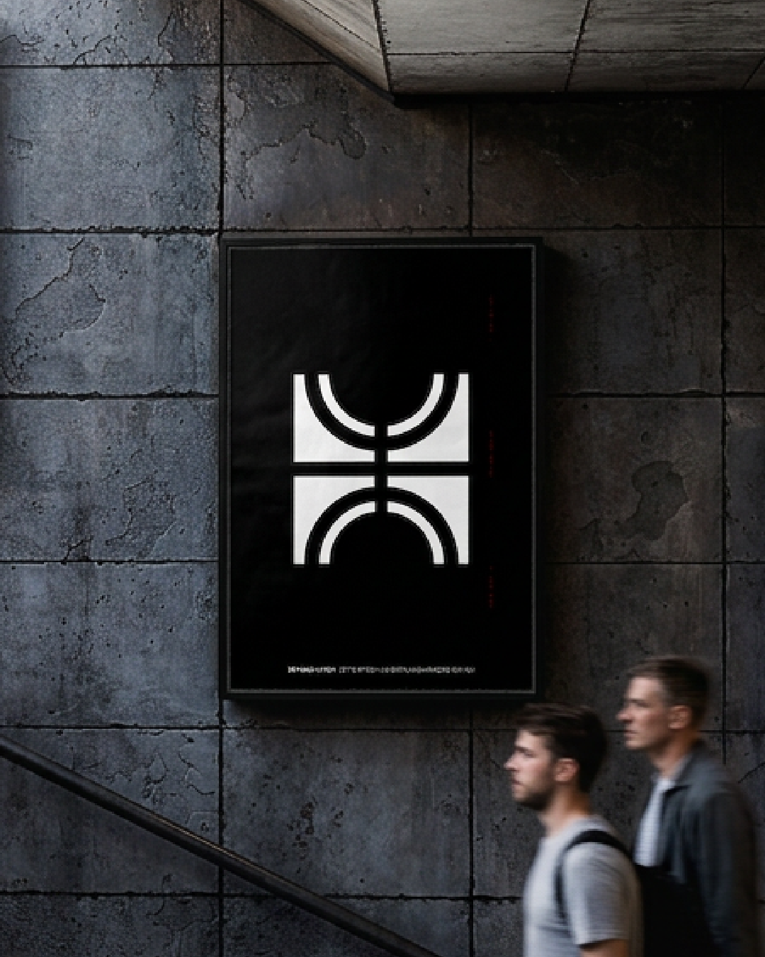
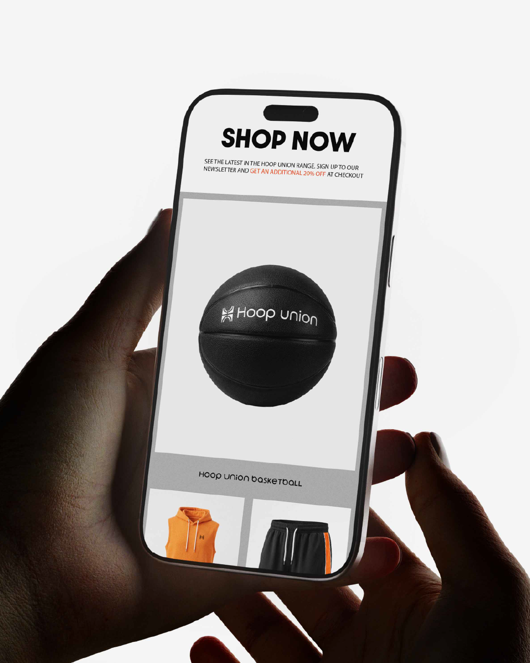
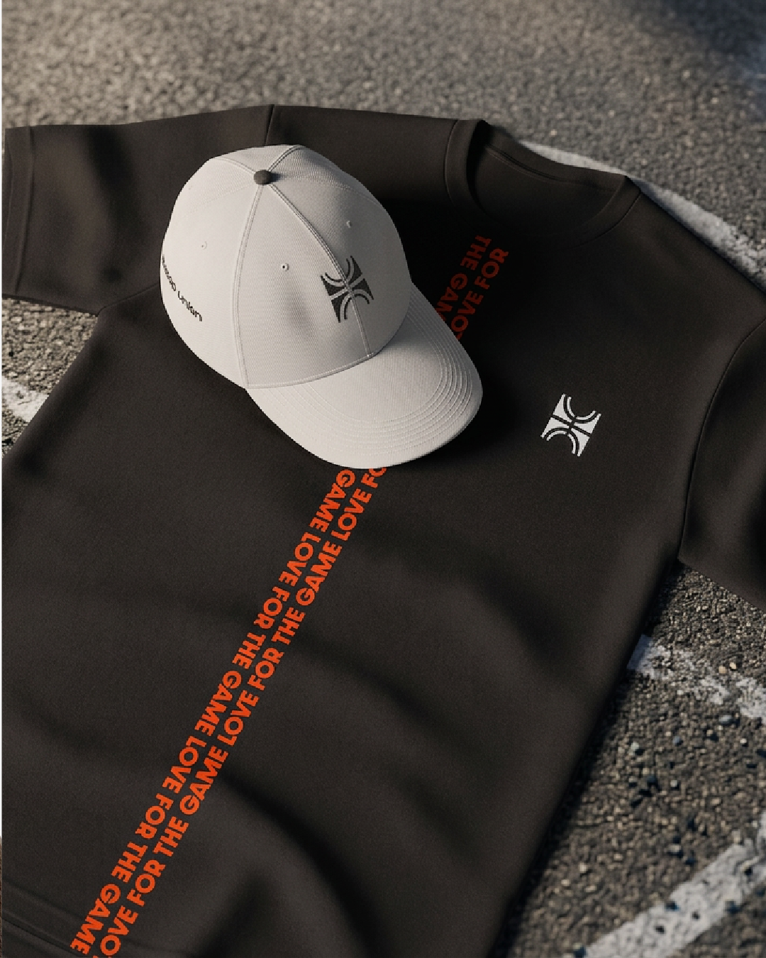

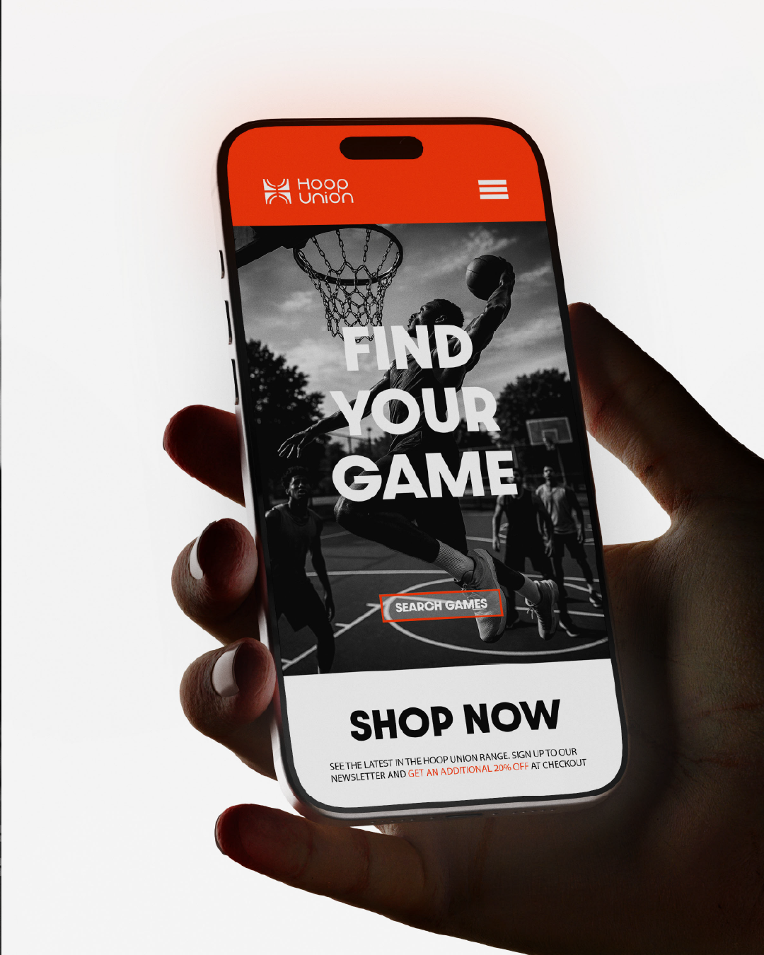
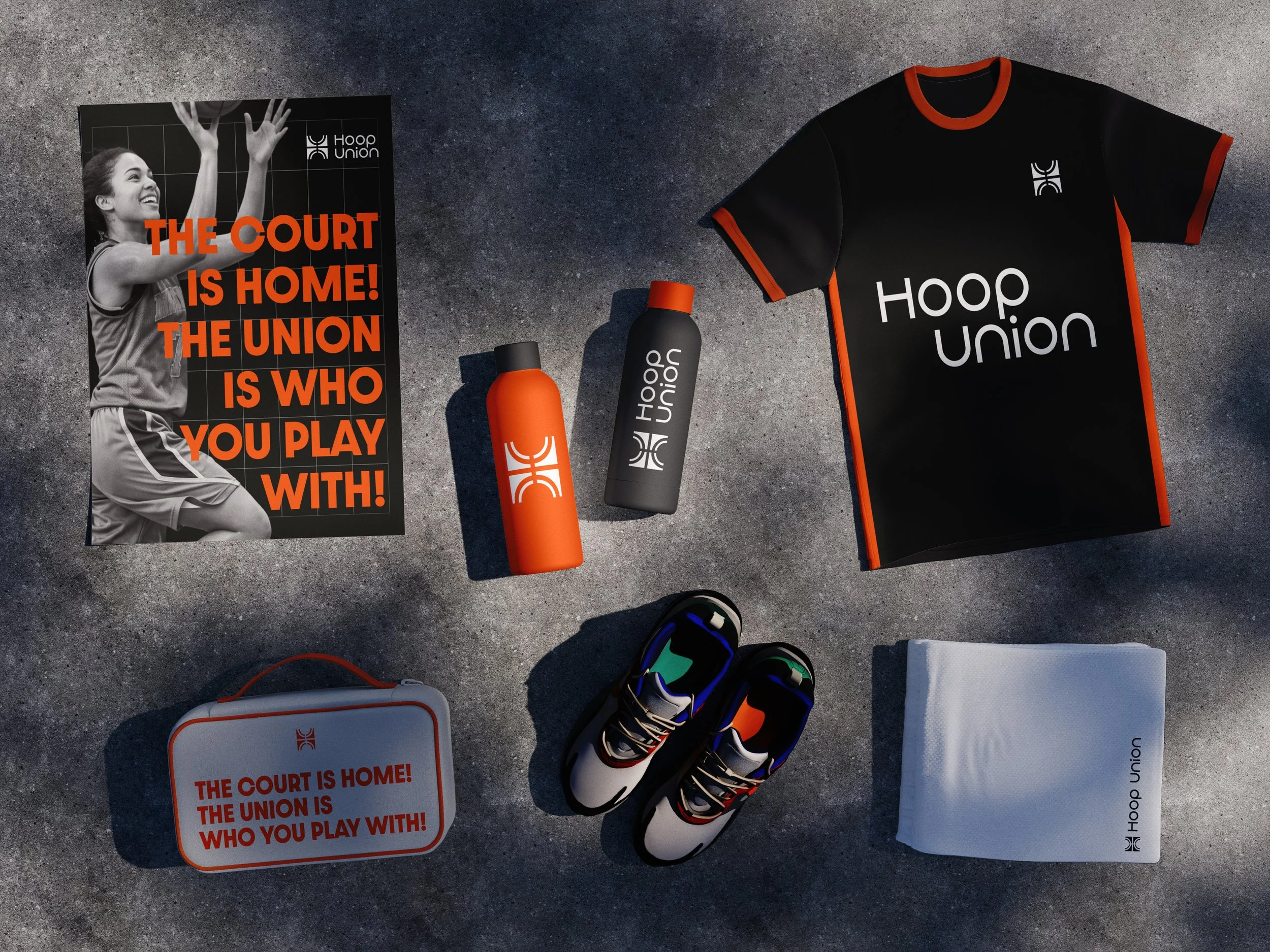

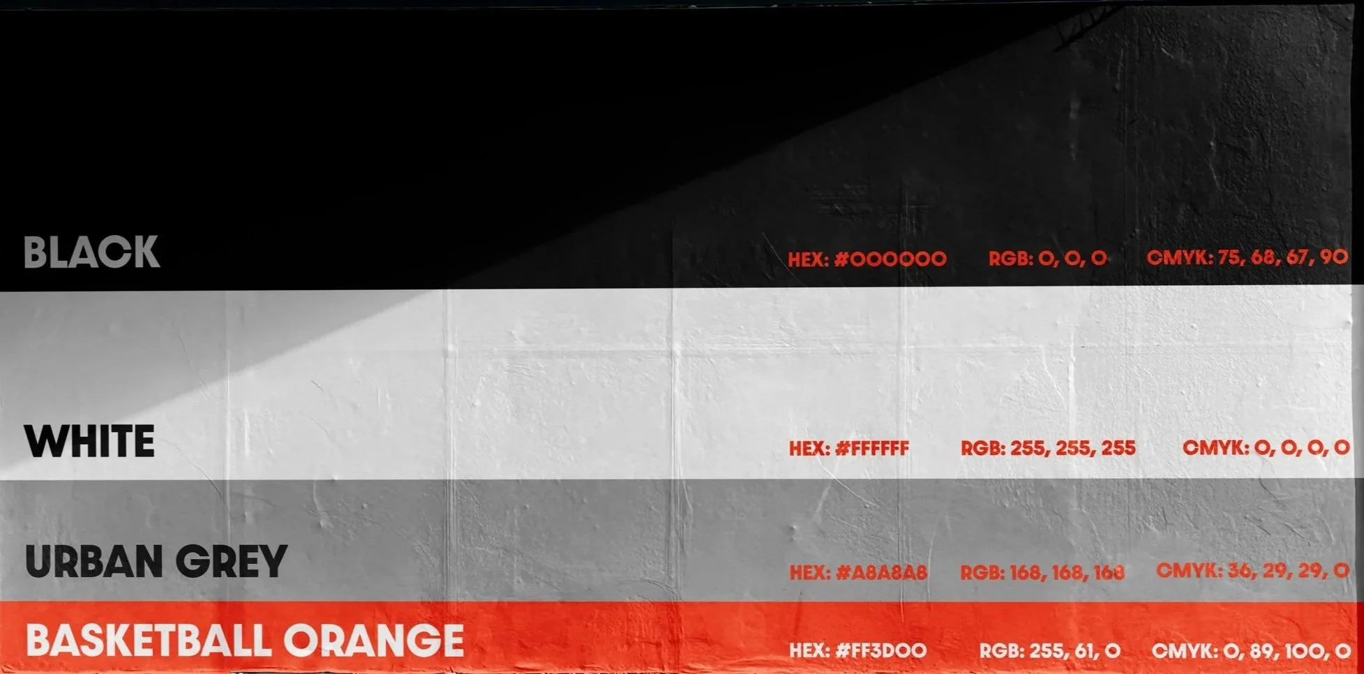
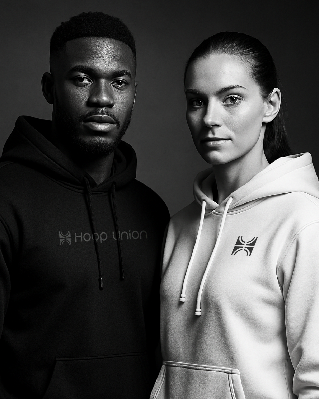
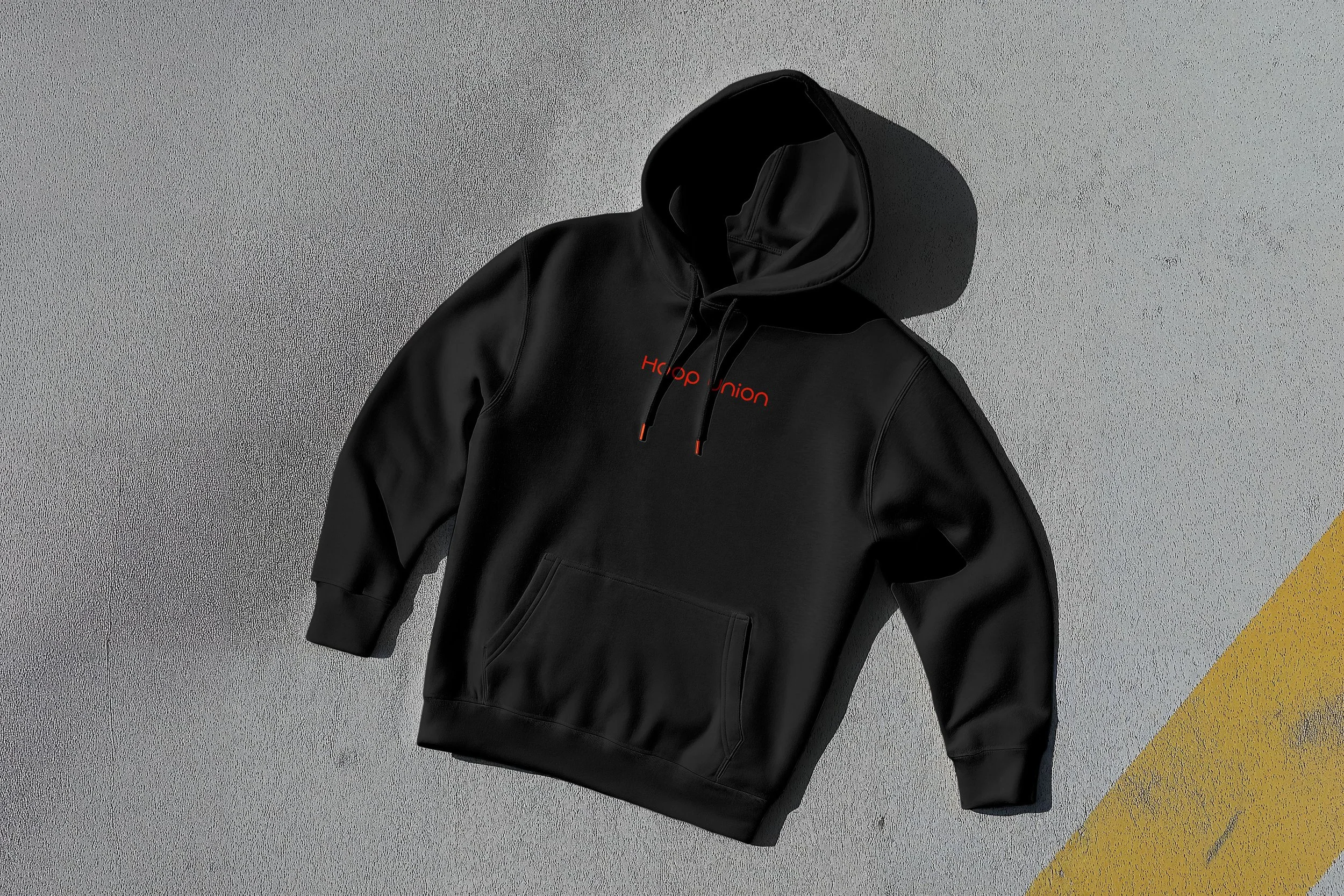
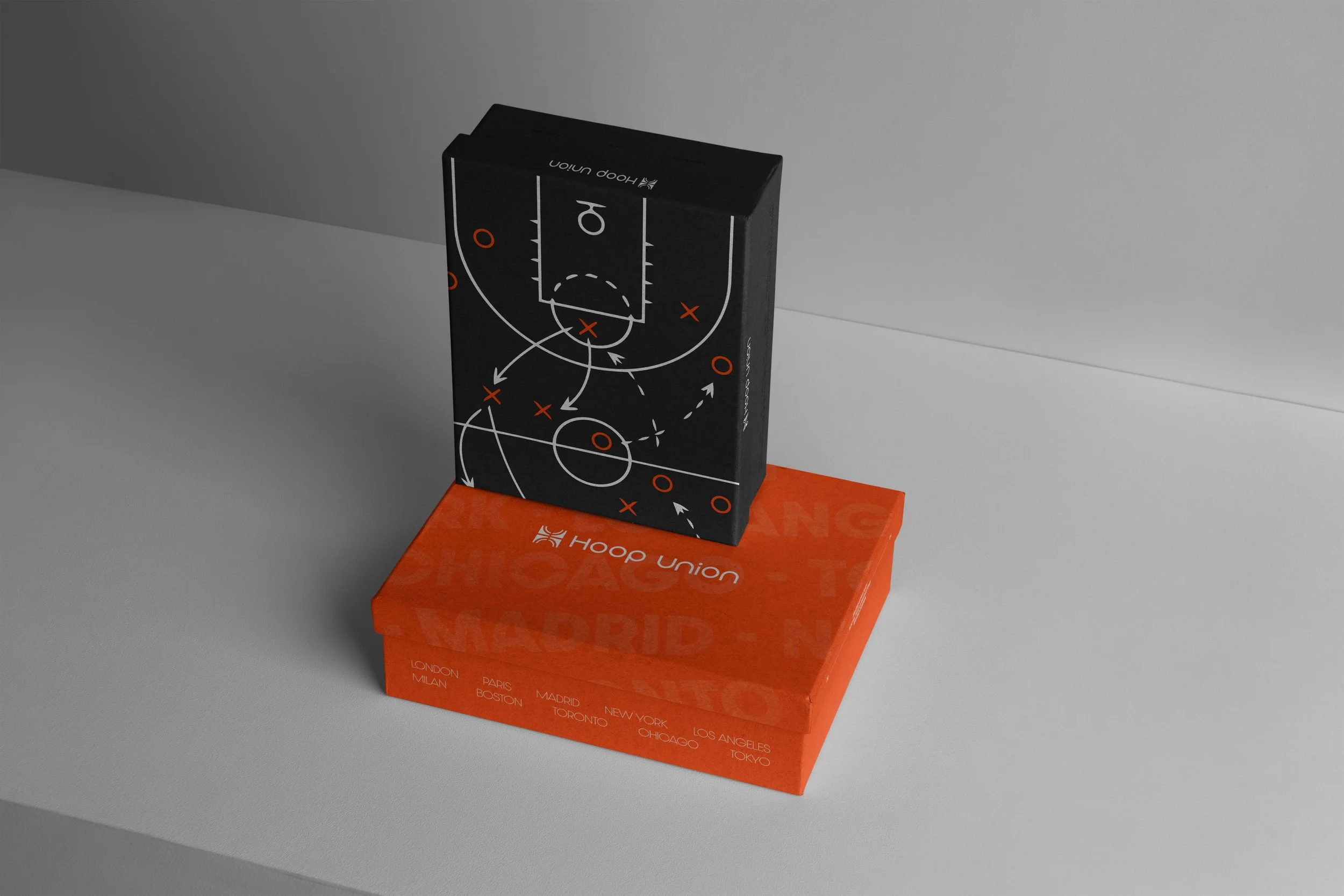
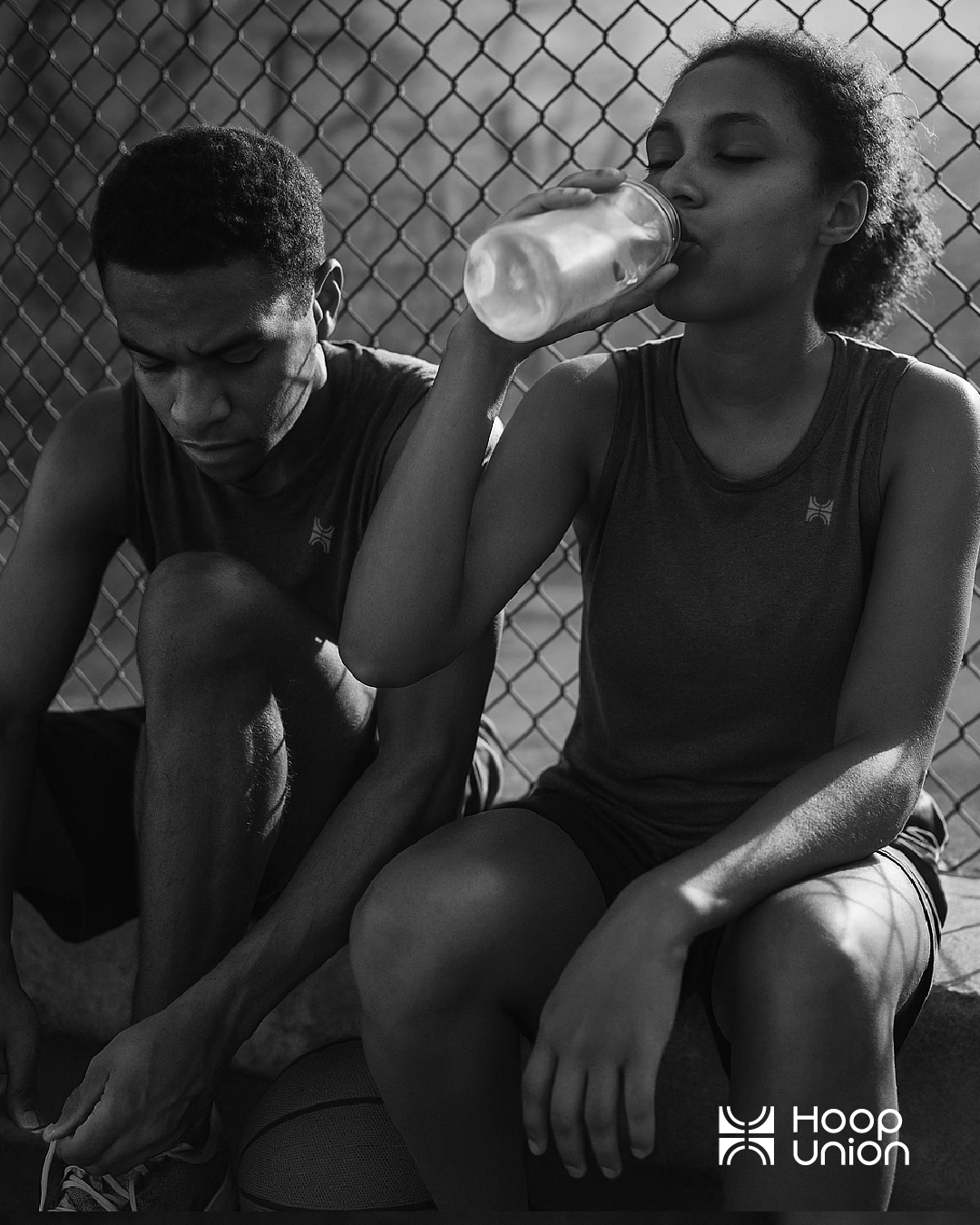
Tribalism is a huge part of sport. It represents which team you belong to. Maybe you’re Knicks fan and don the orange and blue or maybe you love the Hornets and wear the purple and teal? Your colours matter. So how do you pick a colour palette that brings each tribe together? Simple you remove it all together. The only colour here is the orange of basketball. for this reason i opted for a black and white colour scheme with an urban grey to bring the street basketball vibe and a detailing of basketball orange to bring a pop. This palette encourages inclusivity, it says leave your colours at the door and let’s play together!
The Colours Scheme:
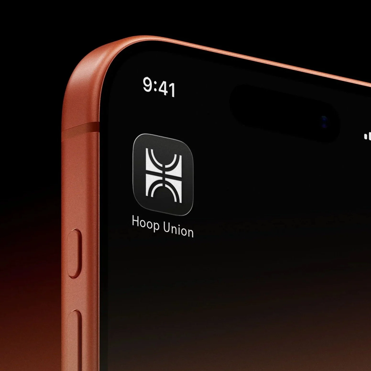
Logo Lockups:

FINAL SAY
This was a really fun concept project to work on. I really enjoyed putting together the identity for it and believe the project turned out really well. I especially like the colour scheme and the use of black and white imagery to remove the ‘tribalism’, creating a truly inclusive experience for all players.
I love designing for sports brands and would love the opportunity to work on more.
Aaron Moriarty
The Designer
If you like what you have seen and want to work with me, why not get in touch by clicking the link below and filling out a contact form.