

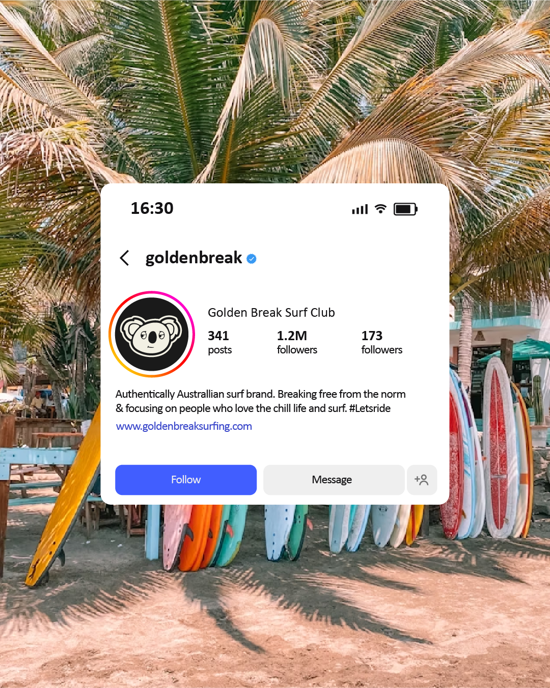
An authenticaly Australian surf brand breaking away from the norm and focusing on people who love the chill life and enjoy the surf.
A free from preassure brand that encourages people to enjoy the now and live in the moment instead of getting caught up in hustle and bustle of the mundain 9-5.
Theres no better way to come to the beach, relax anjoy the surf and most importantly enjoy the company of those around you.
GOLDEN BREAK SURF CLUB
Client
Golden Break Surf Club
Year
2026
Logo Design
Brand Indentity
Visual Identity
The Origin
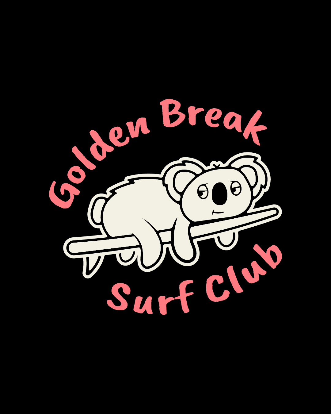
I wanted to move away from what a sterotypical surf logo would be, and create something different. Something that represents a relaxed and easy lifestyle, away from the 9-5 and the koala is a perfect represention of slowing down and taking it easy. koala are renowned for being chill dudes, enjoying life and thier pace. Which is exactly what Golden Break Surf Club represents.
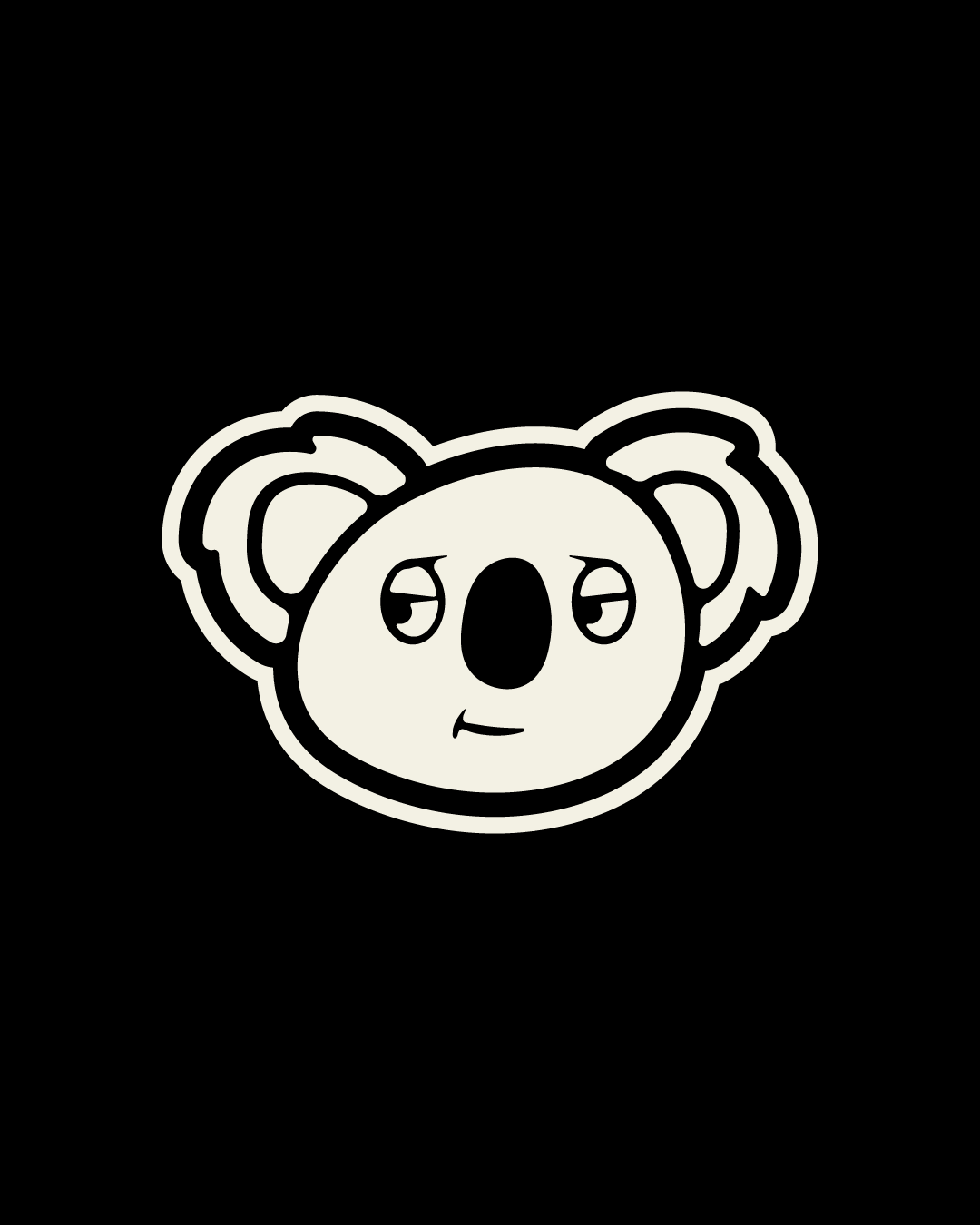
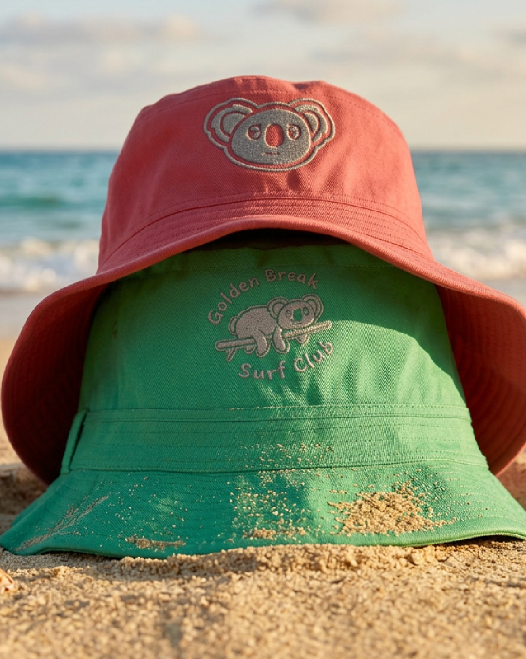
The koala is an icon of Australia and works as the perfect mascot for a people focused surf club based in Australia. The lazy looks represents the slow life and enjoying free time at your own pace and him resting on a surfboard in the alternative logo showcases that surfing doesnt have to be highly competative and big waves, it can be calm and enjoyable where the focus is on the community and being with other surfenthusiants.
The Logo
BRAND KEY WORDS
01
Slow
02
Relaxed
03
Bold
04
Stress Free
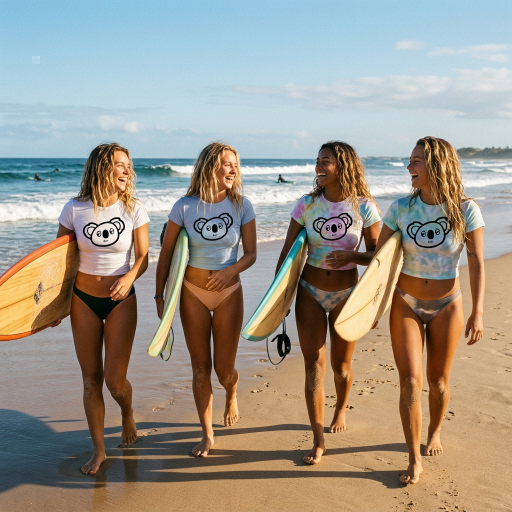
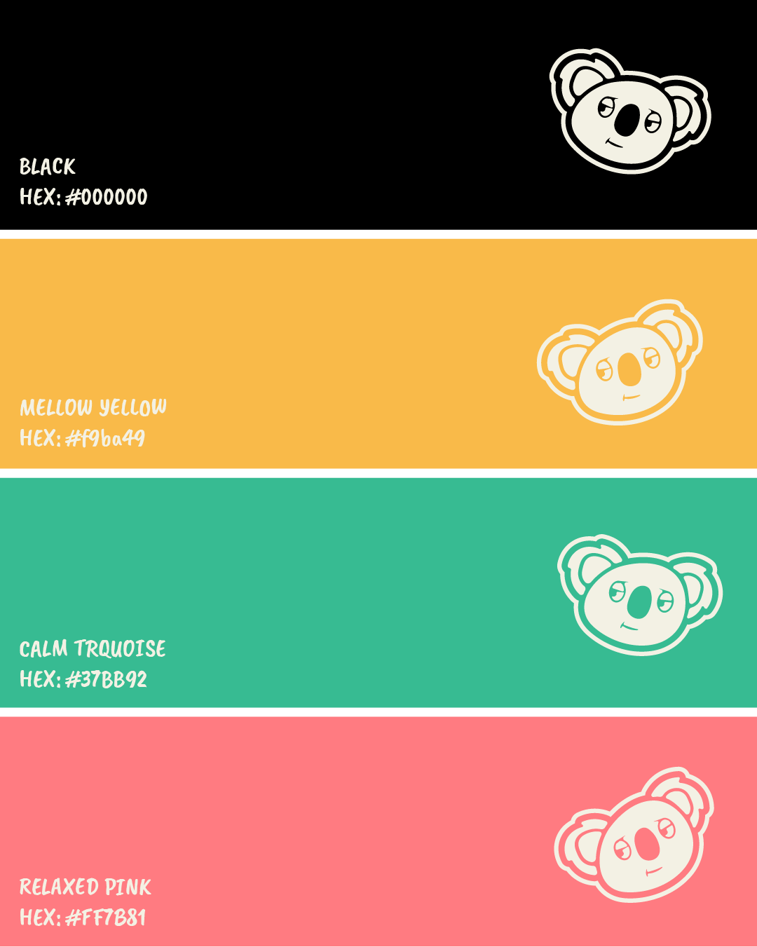
The mascot logo, is quite a playful design and so it needed a colour palette to match it. the black acts as the base and greate a bild visual with the offwhite of the logo.
As the brand features the word Golden in the name it was only right to include a golden shade and so i opted for a a mellow yellow which is a saturated tone from a golden yellow.
Yellow and green are true Austrlaians colours, but i wanted something that reflected some sort of green to give a hint of Australian vibes but i wanted to avoid the cliche colours, so i opted for a Clam turquoise, this also compliements the yellow with its saturated look and contrasts really nicely from the black.
Finally to bring that additonal pop of colour i opted for a relaxed pink, again it gives a nice contrast to the black creating a bold visual and it pairs nicely with the yellow and turquoise. and the shades of each colour i think reflect a nice sunkissed/saturated look that perfectly fits the brand.
The Colours Scheme:
FINAL SAY
This brand was really fun to work on, and quite the challange. It started with a humourous idea of a koala on a surf board and turned in a fun mascot logo that I think perfectly represents the mindset this brand intended to be. A relaxed, friendly atmosphere for surf lovers.
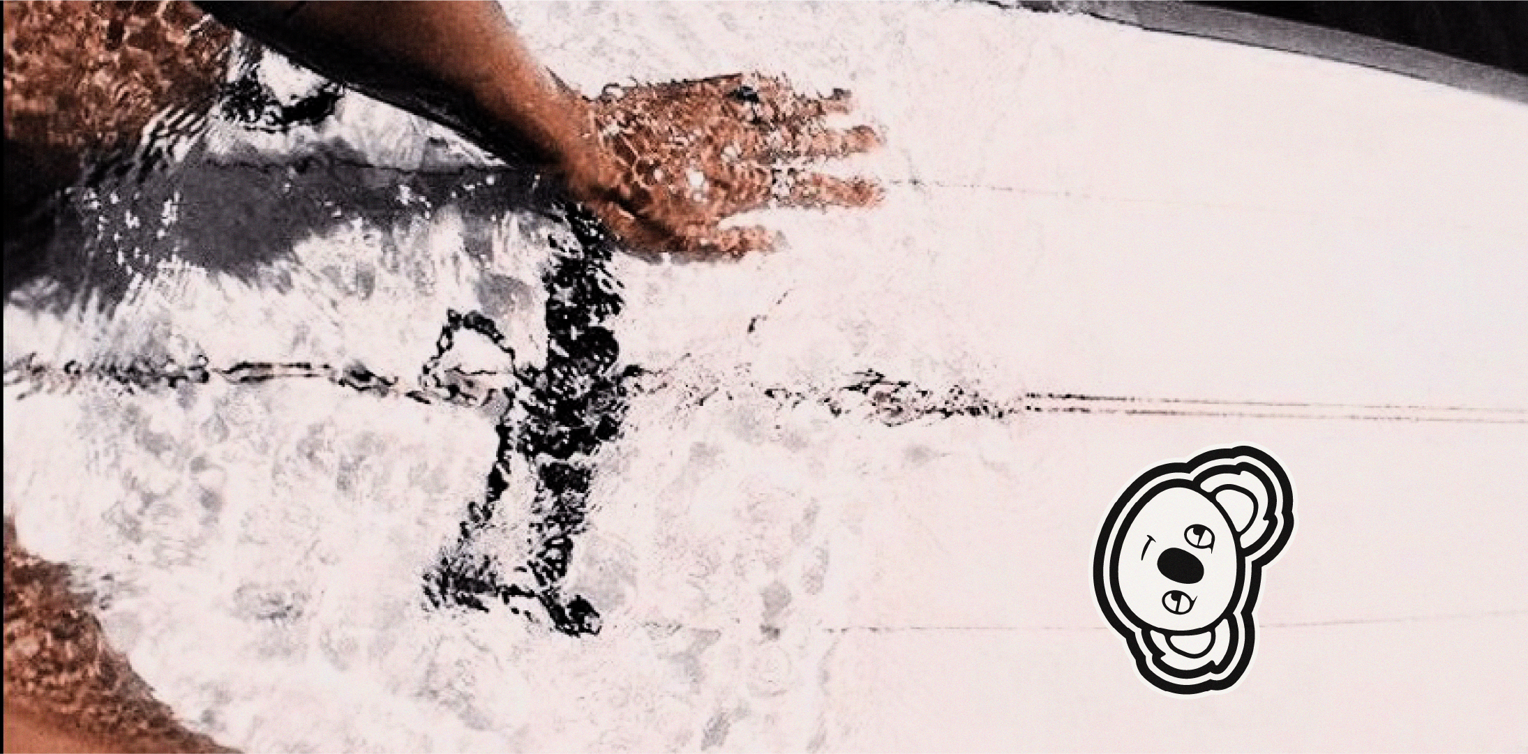
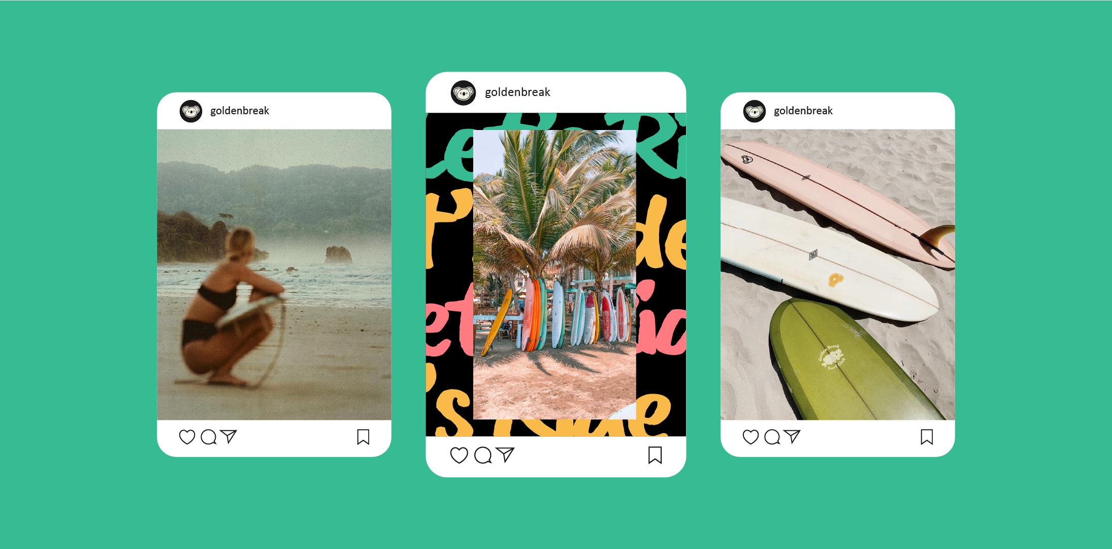
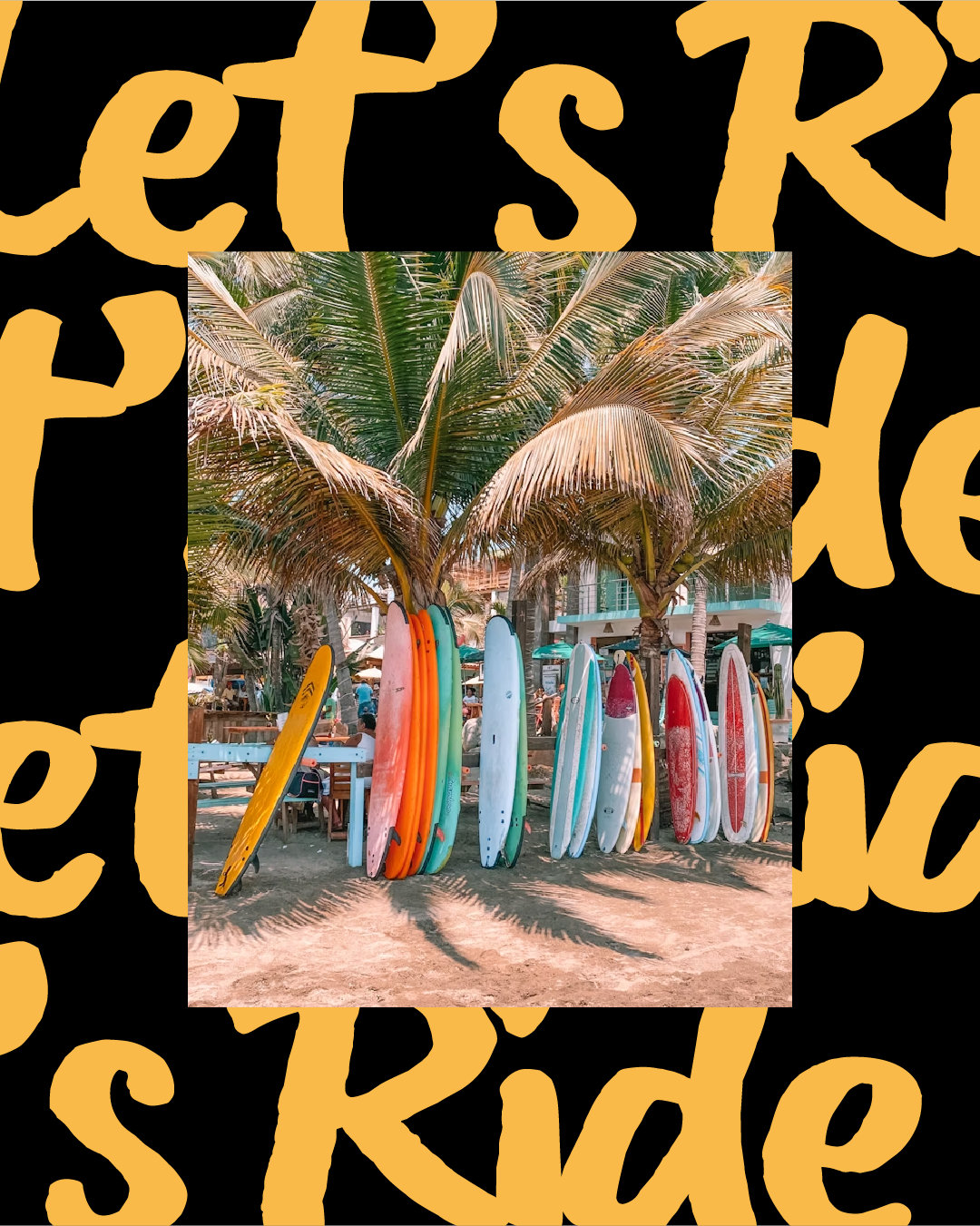
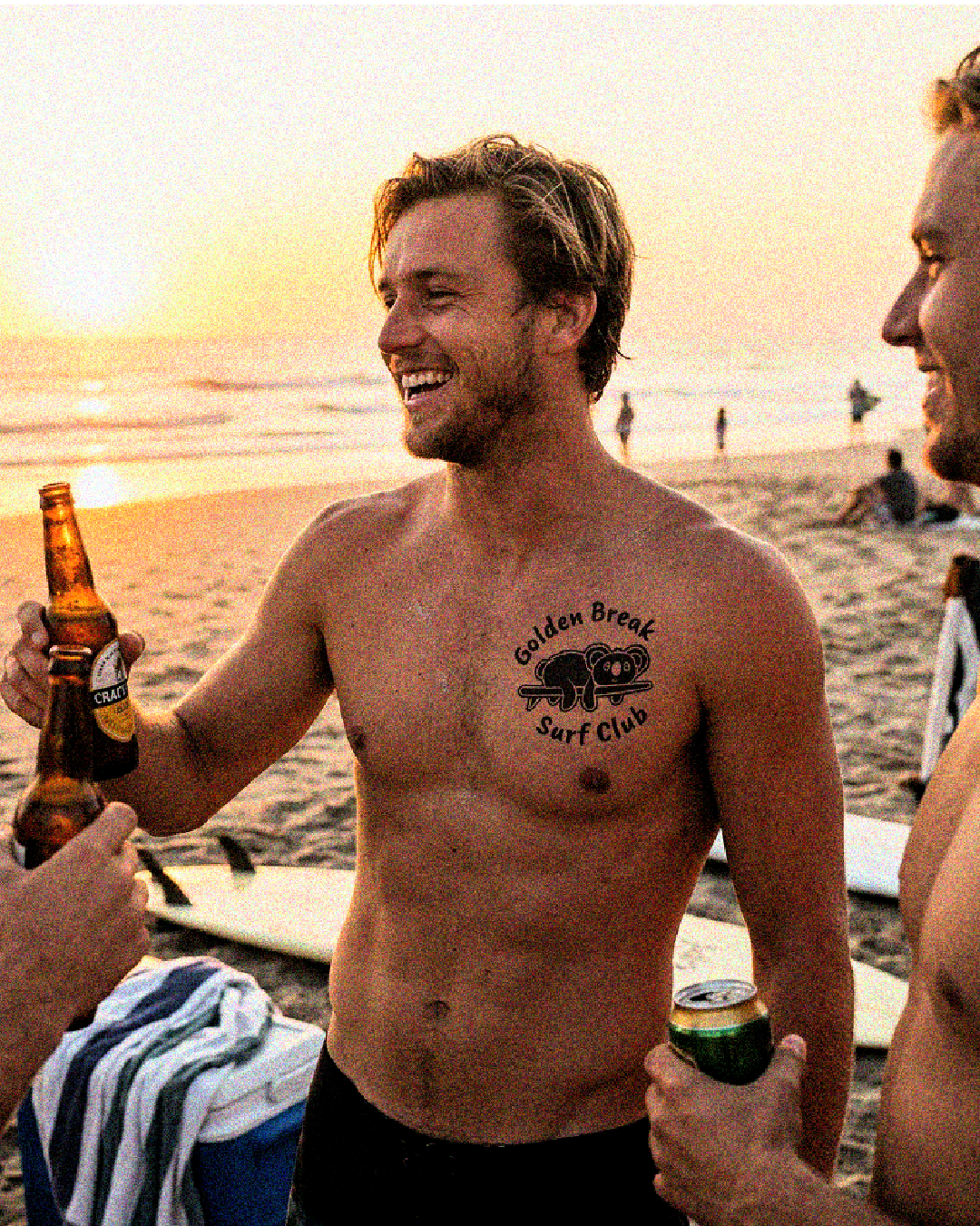
The grainy images also help bring that sun kissed sandy aesthetic to life so nicely completing a full visual identity.
Aaron Moriarty
93 Design Studio
If you like what you have seen and want to work with me, why not get in touch by clicking the link below and filling out a contact form.