
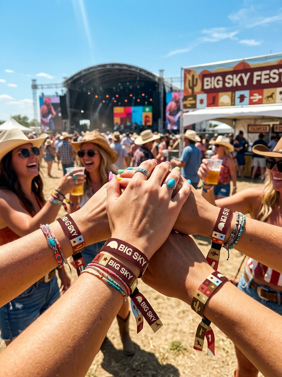
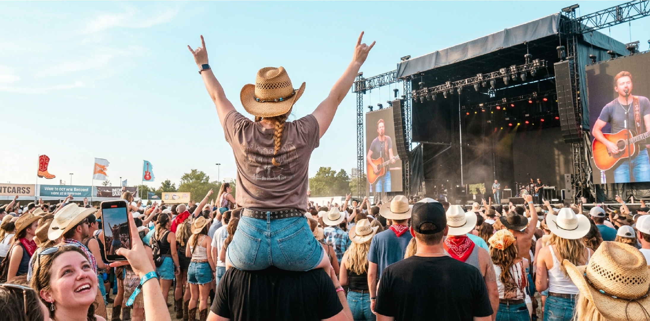
A country music and culture festival built for the wide open spaces of Missoula, Montana. Big Sky Festival is a multi-day music festival celebrating country music, cowboy lifestyle and culture.
Designed for country music lovers, campfires, cold beers, live music, and a chance to let their inner cowboy or cowgirl out.
BIG SKY FESTIVAL
Client
Big Sky Festival
Year
2026
Logo Design, Brand Indentity, Merch, Packaging & Print Design
The Origin
Big Sky Festival started with a simple brief: create a festival brand that feels like Montana itself. Not a themed experience, not a costume, the genuine warmth, space, and freedom of Big Sky Country.
The challenge was avoiding every Western cliché in the book. No cartoonish cowboys. No wanted poster typography. No horseshoes or sheriff badges. The brief demanded something that felt authentically rooted in the landscape and culture of Montana without tipping into fancy dress.
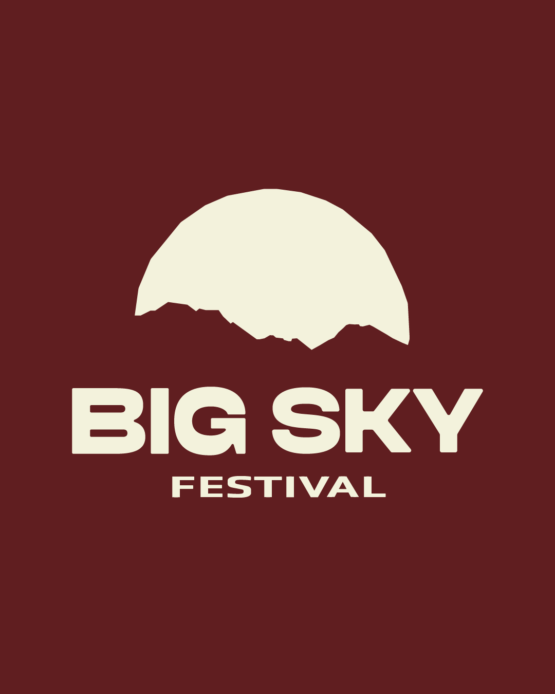
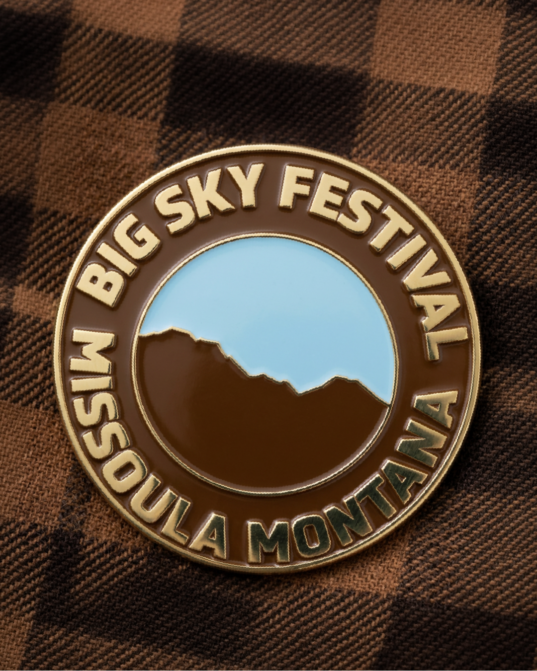
The solution came from the landscape itself. Montana's nickname is Big Sky Country, named for the vast, uninterrupted sky that defines the state. That sky became the logo. The mark is a silhouette of the Rocky Mountain range specific to Montana, with the sky sitting as negative space at the heart of the mark. Simple, ownable, and rooted in place. The kind of logo you could draw from memory after seeing it once.
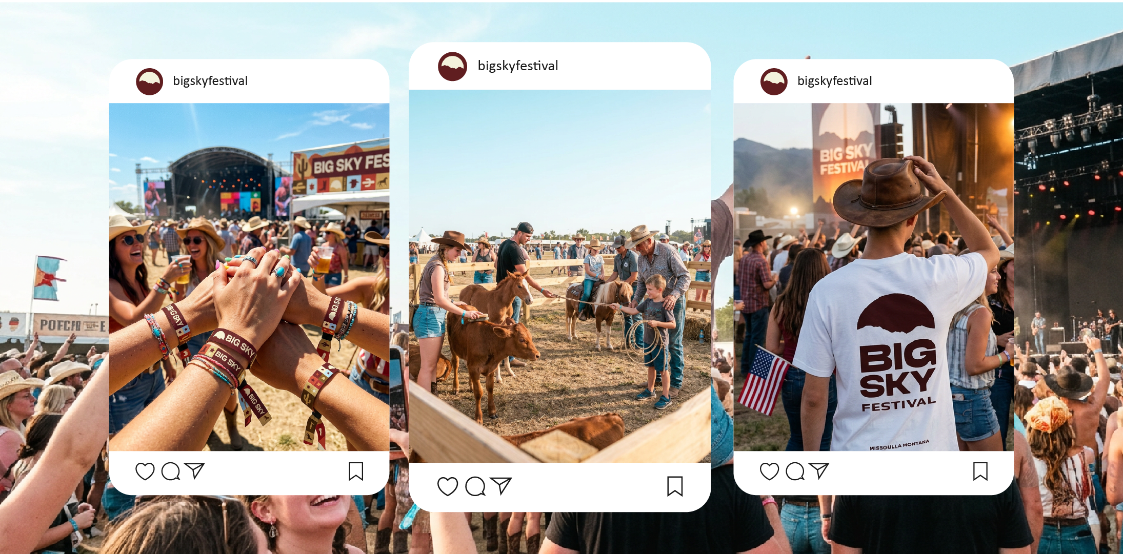
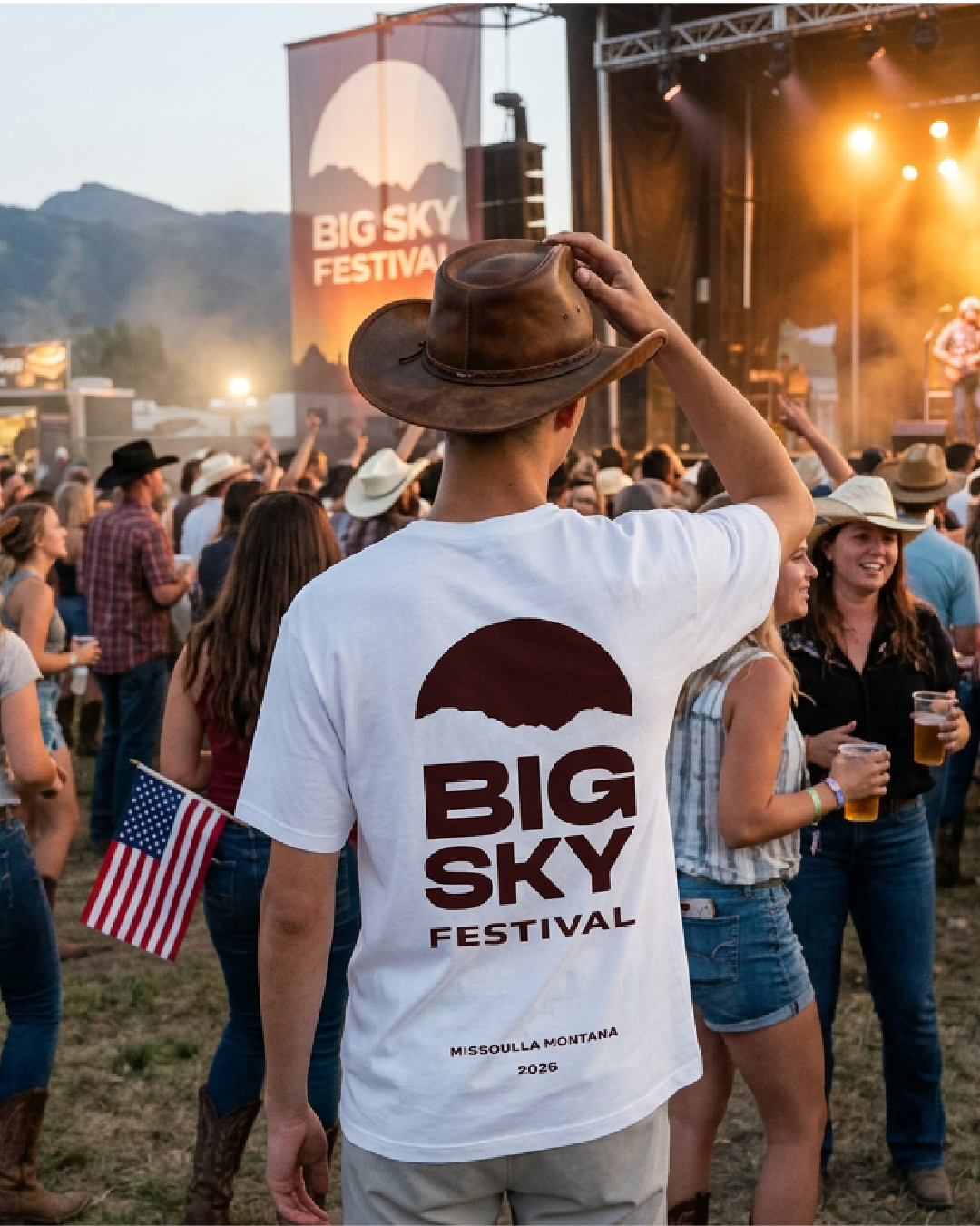
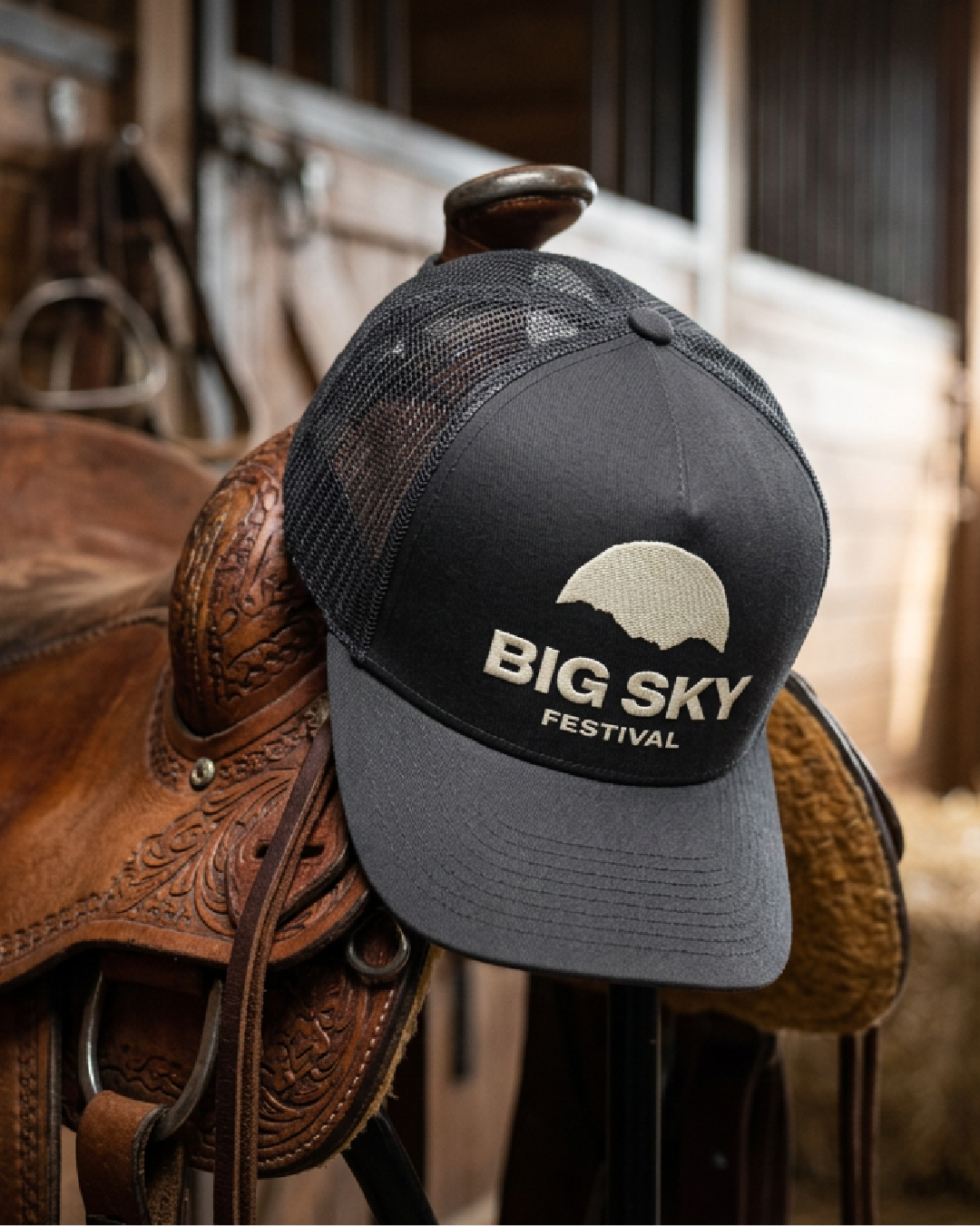
The primary logo mark is built around the Rocky Mountain silhouette, the actual mountain range that defines Montana's horizon. The negative space within the mark represents the big sky the festival is named after. It's minimal by design. A festival brand has a lot of moving parts, posters, wristbands, stage backdrops, merch, signage and the logo needs to sit quietly within all of it rather than compete with it.
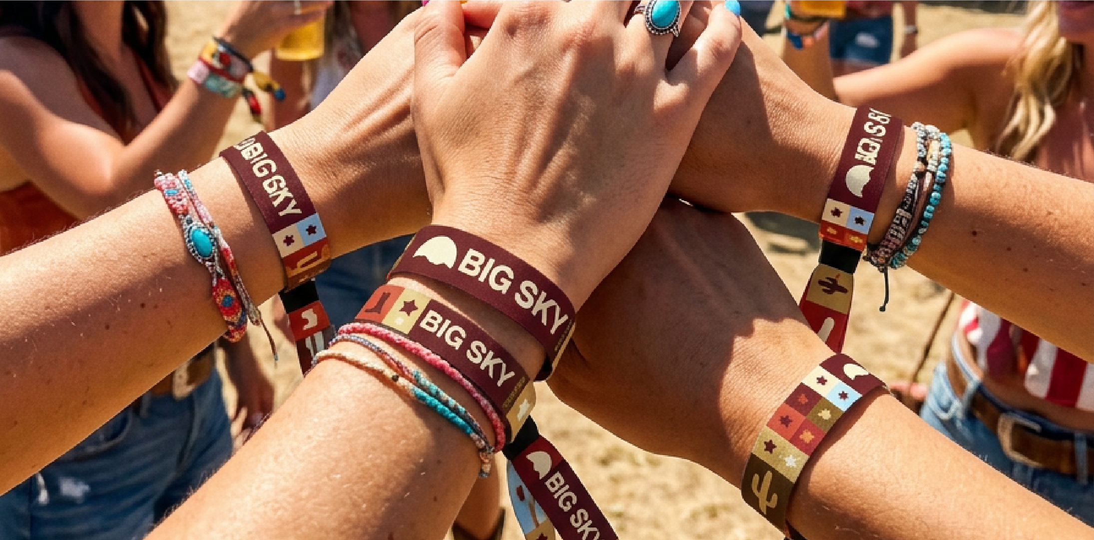
The mark works at every scale. Embossed on a wristband at 15mm or printed on a stage backdrop at 10 metres wide, it holds. That scalability was an important part of the design process.
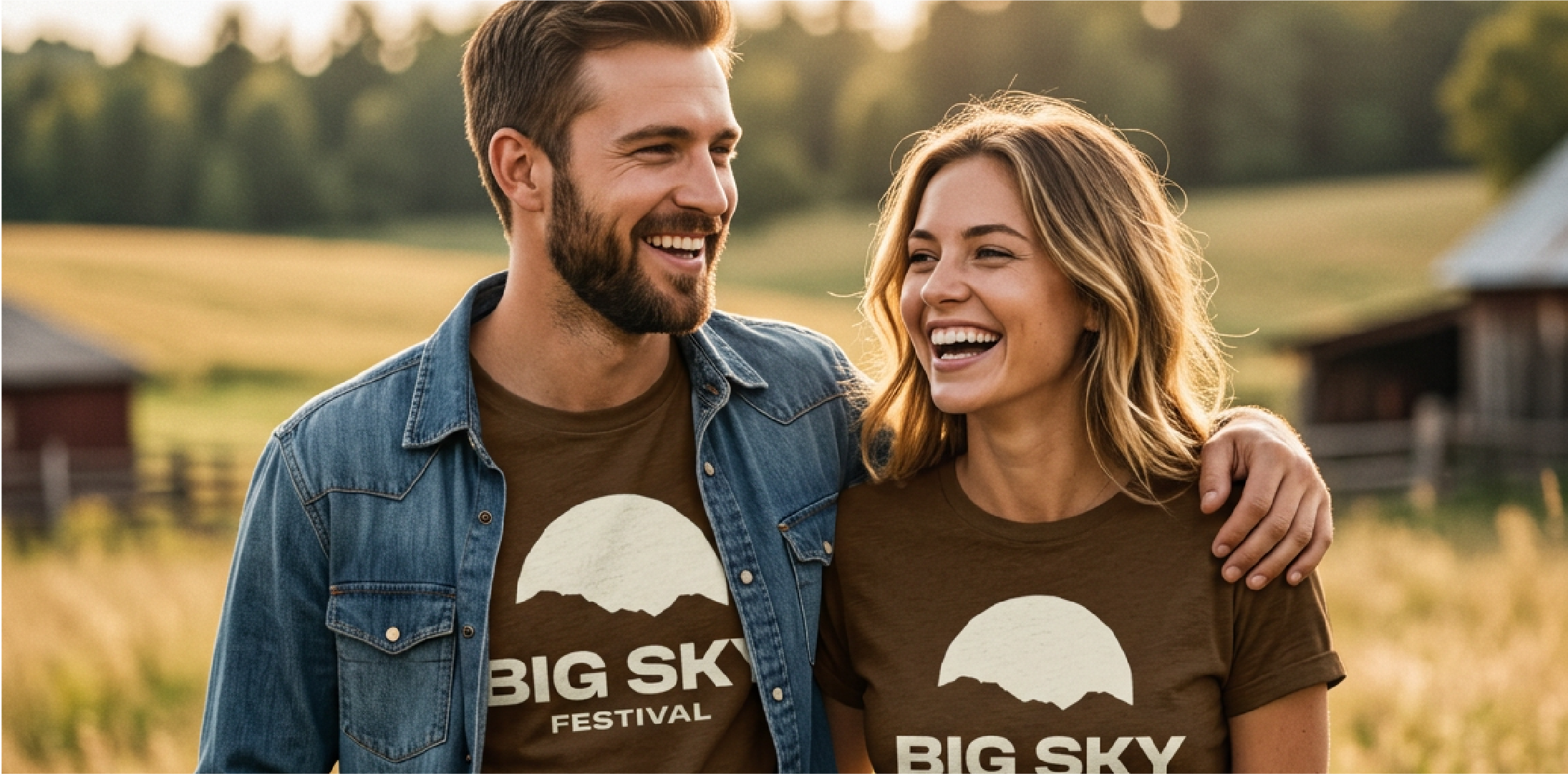
The full logo lockup pairs the mark with BIG SKY FESTIVAL set in a bold, characterful typeface that carries that county-western DNA without feeling like a period costume. Confident, wide, and built to last.
The Logo
TheTypography
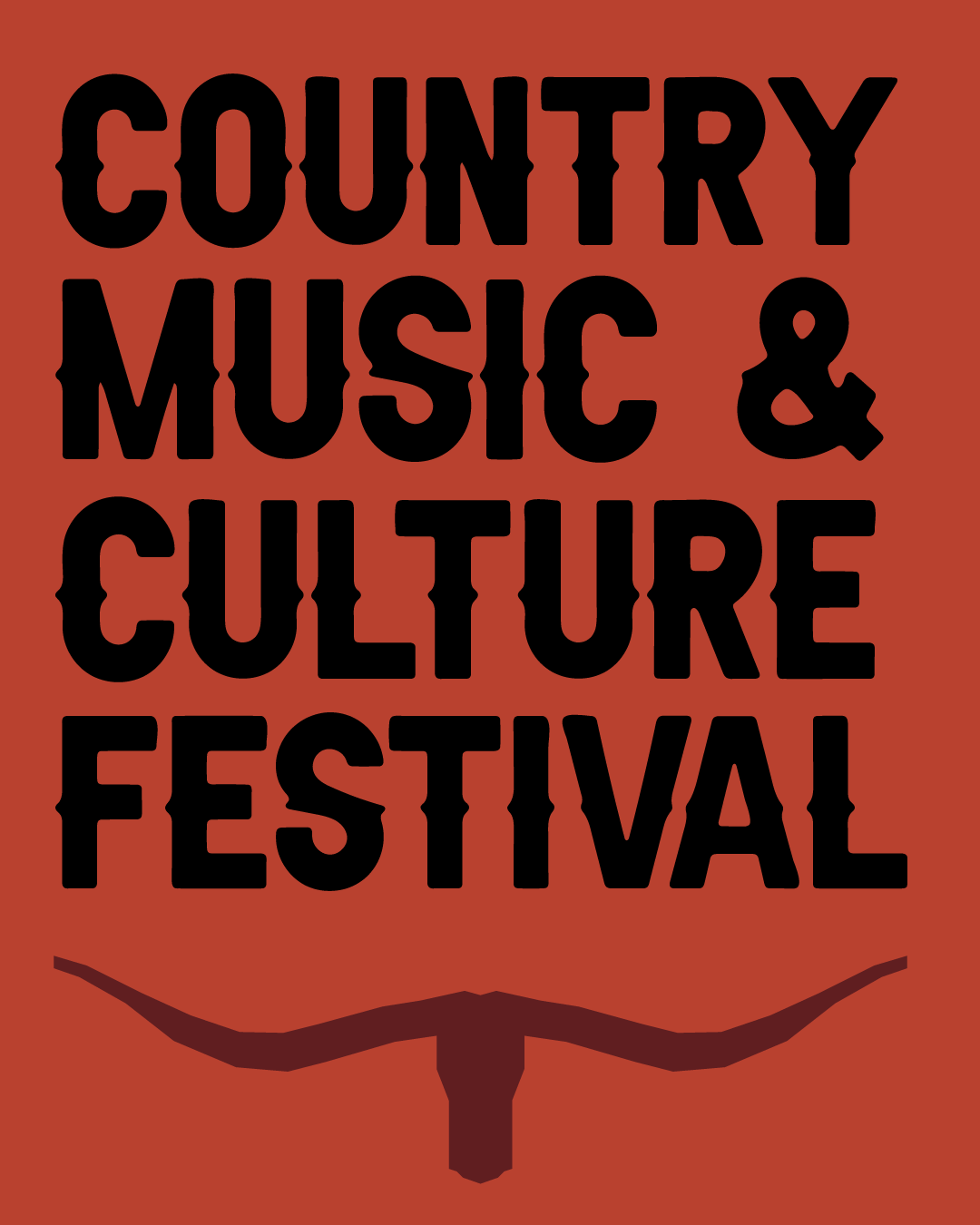
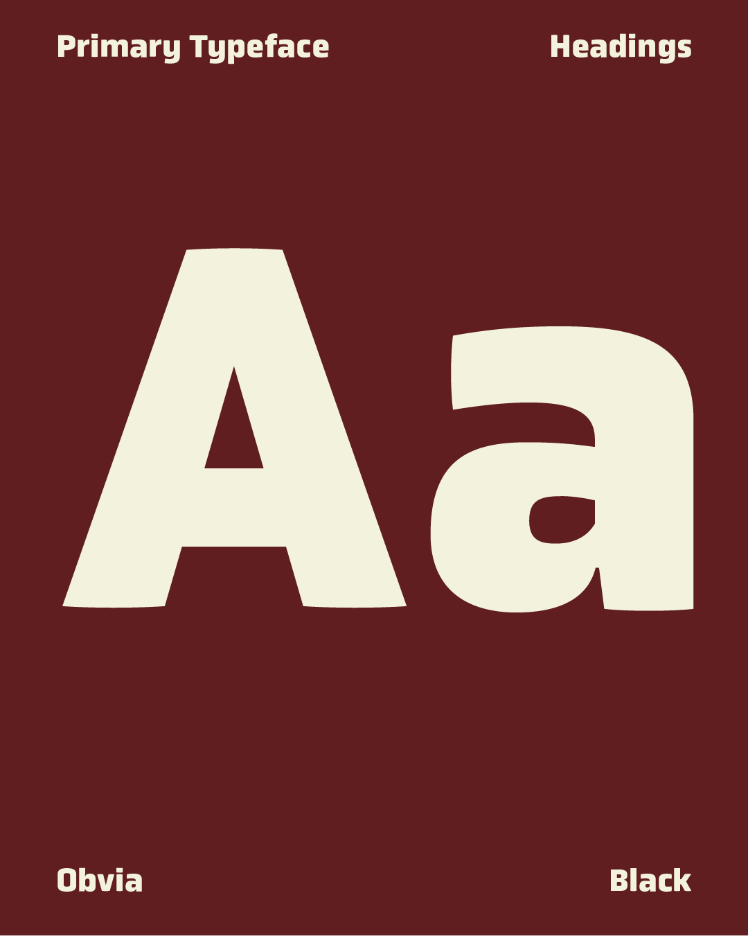
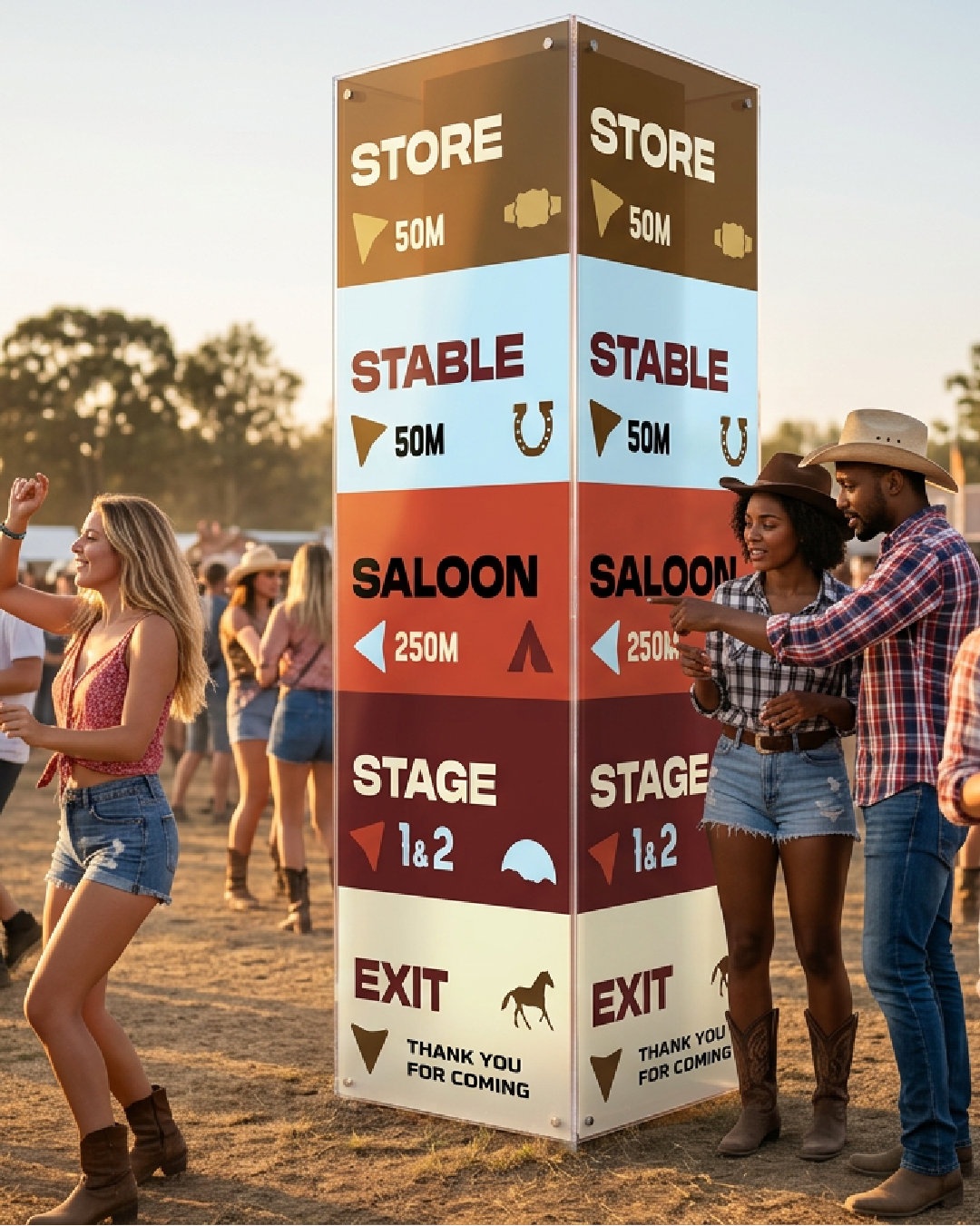
The typography system uses multiple typefaces deliberately. This is a festival brand, not a corporate identity. Variety in type creates energy, movement, and visual interest across a complex brand system that spans posters, signage, merch, digital, and print.
The headline typeface carries the Western heritage of the brand, bold, wide, and authoritative. Supporting typefaces bring structure and legibility to information-heavy assets like the festival schedule and wayfinding signage. The system is varied but intentional. Every typeface earns its place.

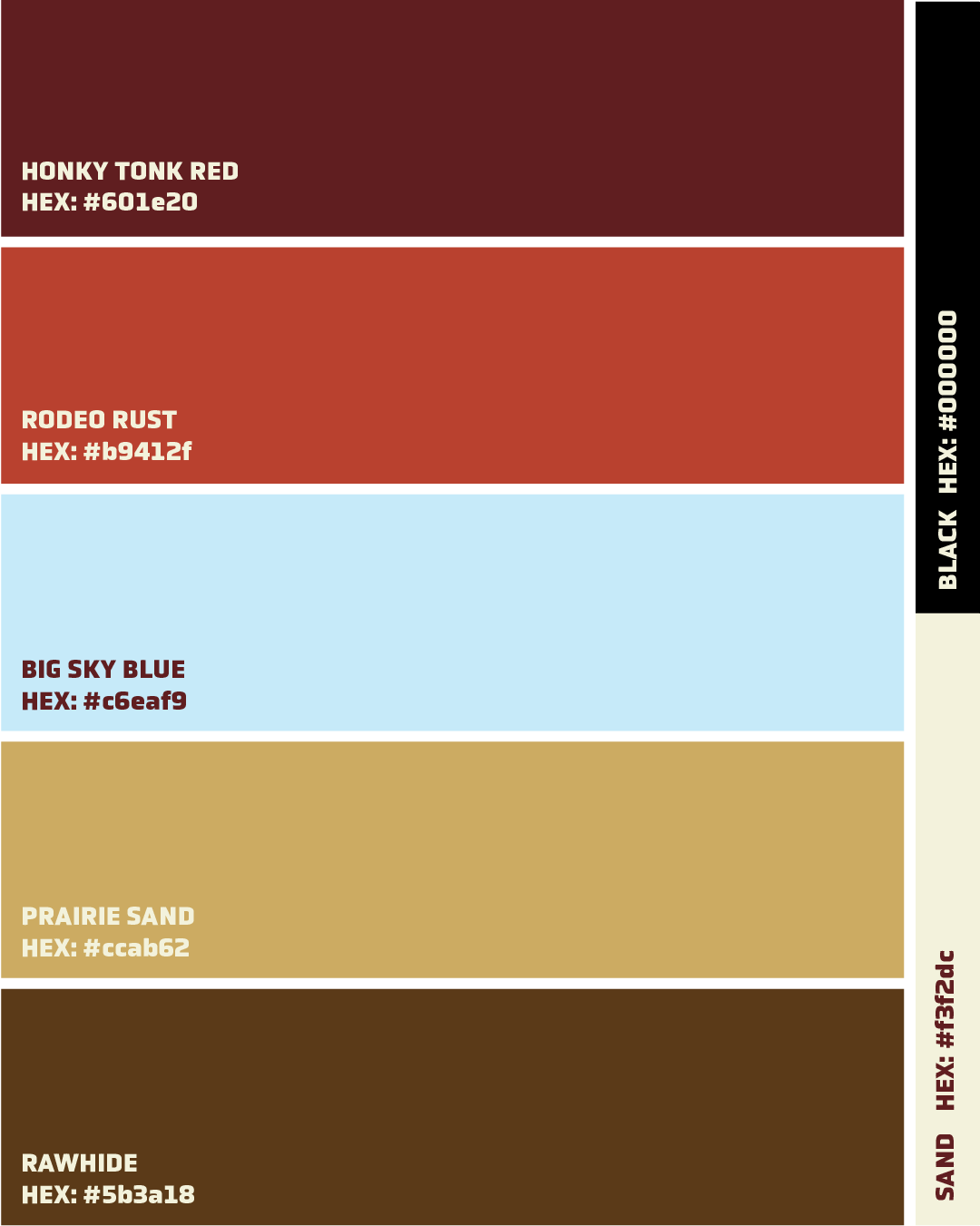
The palette is entirely drawn from the Montana landscape and Western heritage.
Honky Tonk Red: The colour of worn leather, old barns, and sunset skies. The dominant brand colour that gives Big Sky Festival its warmth and confidence.
Prairi Sabd: The dusty, sun-bleached earth of the Montana plains. Used as a secondary background and supporting colour throughout the system.
Rawhide: Deep and grounding, used for type and structural elements. Feels like weathered wood and saddle leather.
Big Sky Blue: You cant have a brand name like Big Sky and not include a blue within the colour palette. this offers a nice contrasting colour to the warmer tones of the reds and browns.
Together the palette gives a sun-warmed, earthy, and completely at home for a cowboy/girl in the open plains of Montana.
The Colours Scheme:

FINAL SAY
Big Sky Festival is a conceptual project built entirely from the brief up: Concept, strategy, naming, visual identity, and brand system. Just the question: what would a festival brand designed for country folk look like if it was built to feel like the place it lives in?
Montana answered that question. The landscape, the culture, the sky: it's all in there, in a reall cowboy culture state.
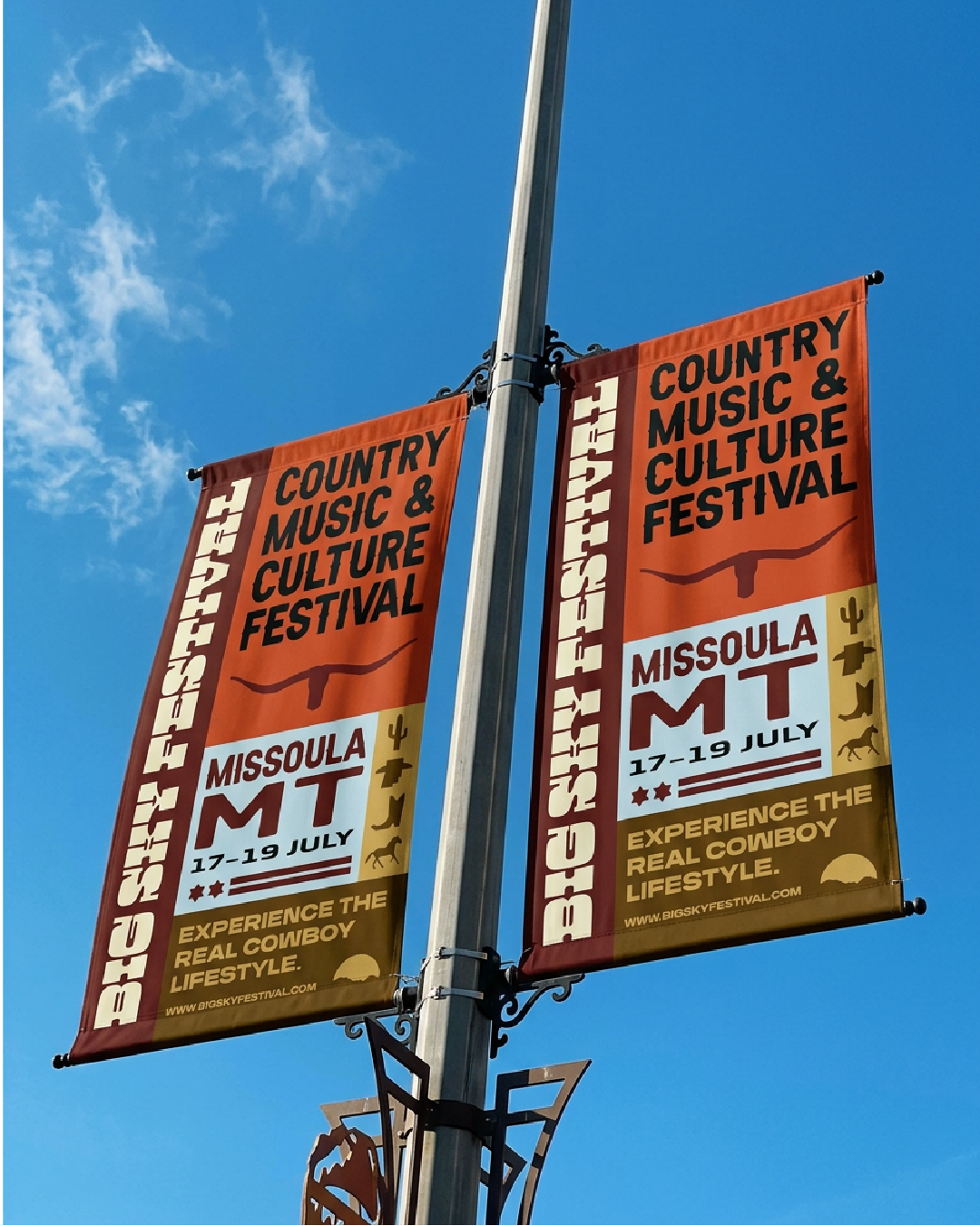
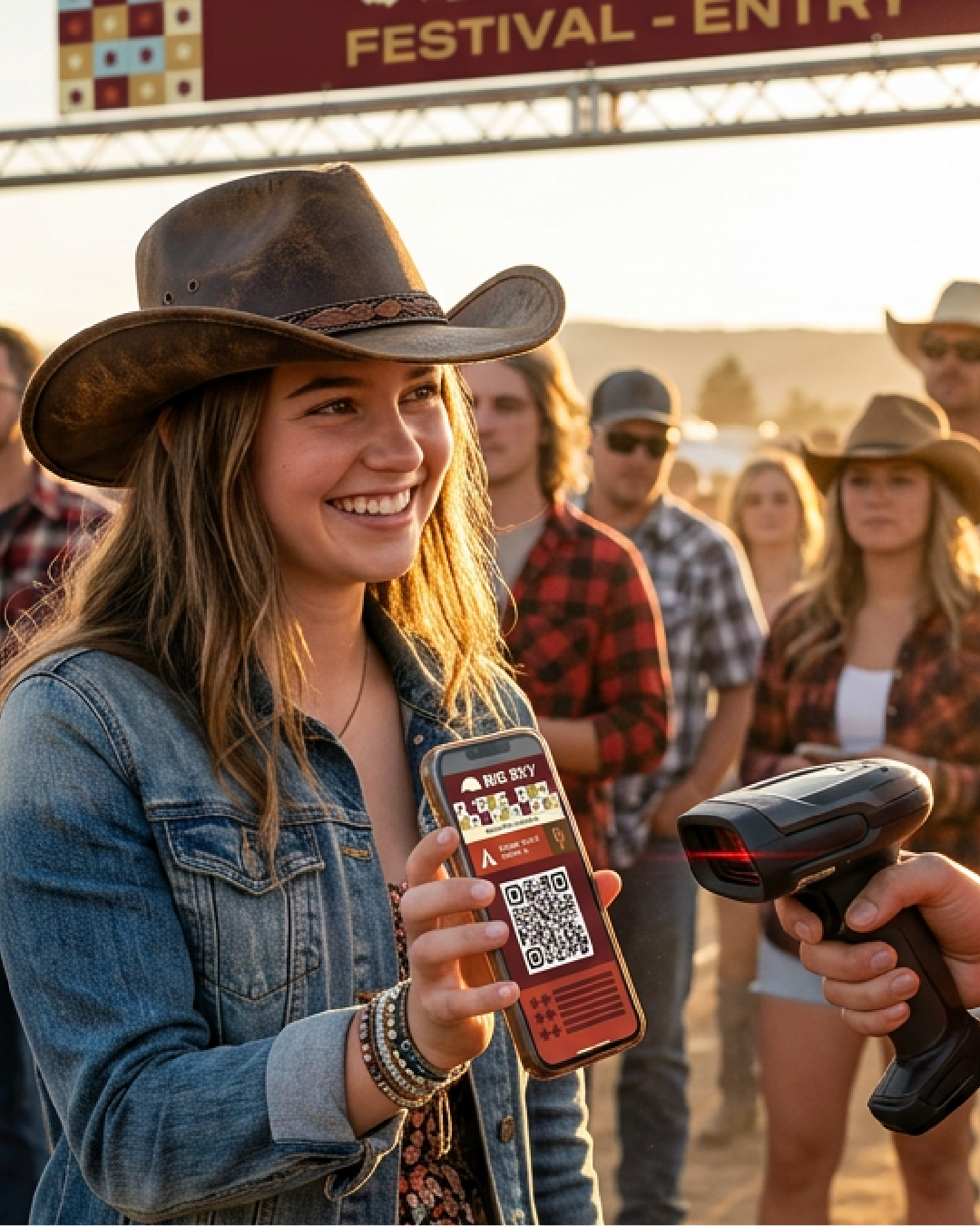
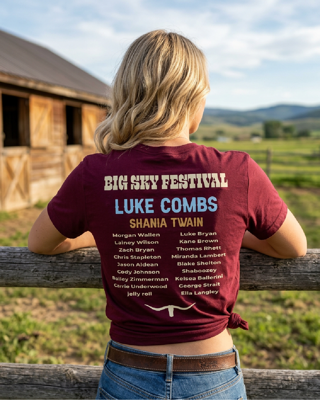
This project pushed me to think about festival branding as a complete system rather than just a logo. From a wristband to a stage backdrop, from a website to a merch range, every touchpoint had to feel like Big Sky Festival. I think it does.
Aaron Moriarty
93 Design Studio
If you like what you have seen and want to work with me, why not get in touch by clicking the link below and filling out a contact form.